Background
Specializing in architecture and construction services, Daga Architects reached out to me with a specific set of goals, of which “International expansion” was a top priority.
I had the chance to work together with their creative team to translate their ideas into a seamless digital experience.
Main challenge
How to reflect Daga’s bold identity and influences on a website?
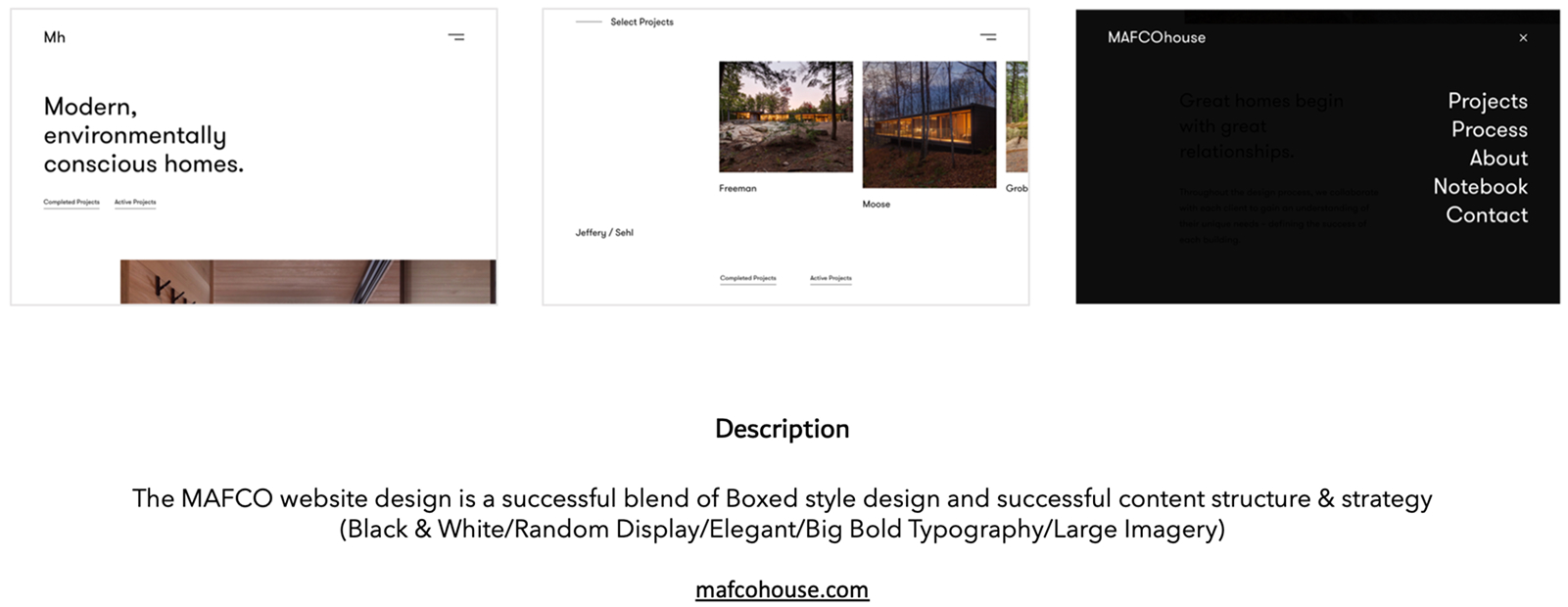
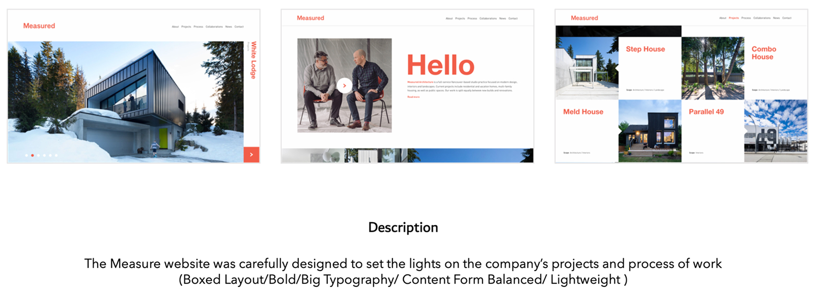
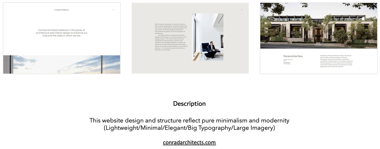
Daga wanted to reflect some of its architectural influences on the design of the website. I worked together with one of their architect teams to explore and understand what wasn’t working in the previous design and looked for inspiration on websites from practitioners in the field of architectural design sharing a profile close to that of Daga while keeping the core of its identity.
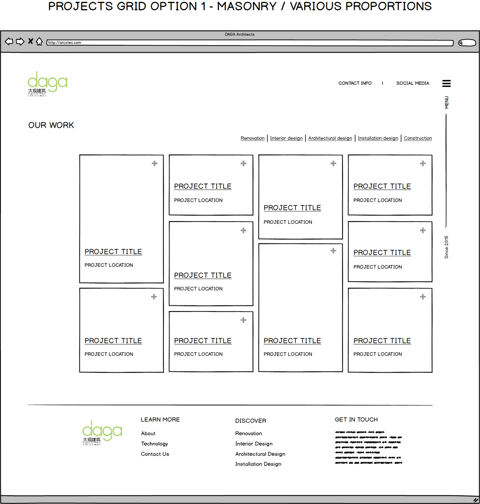
Lo-fi Wireframe
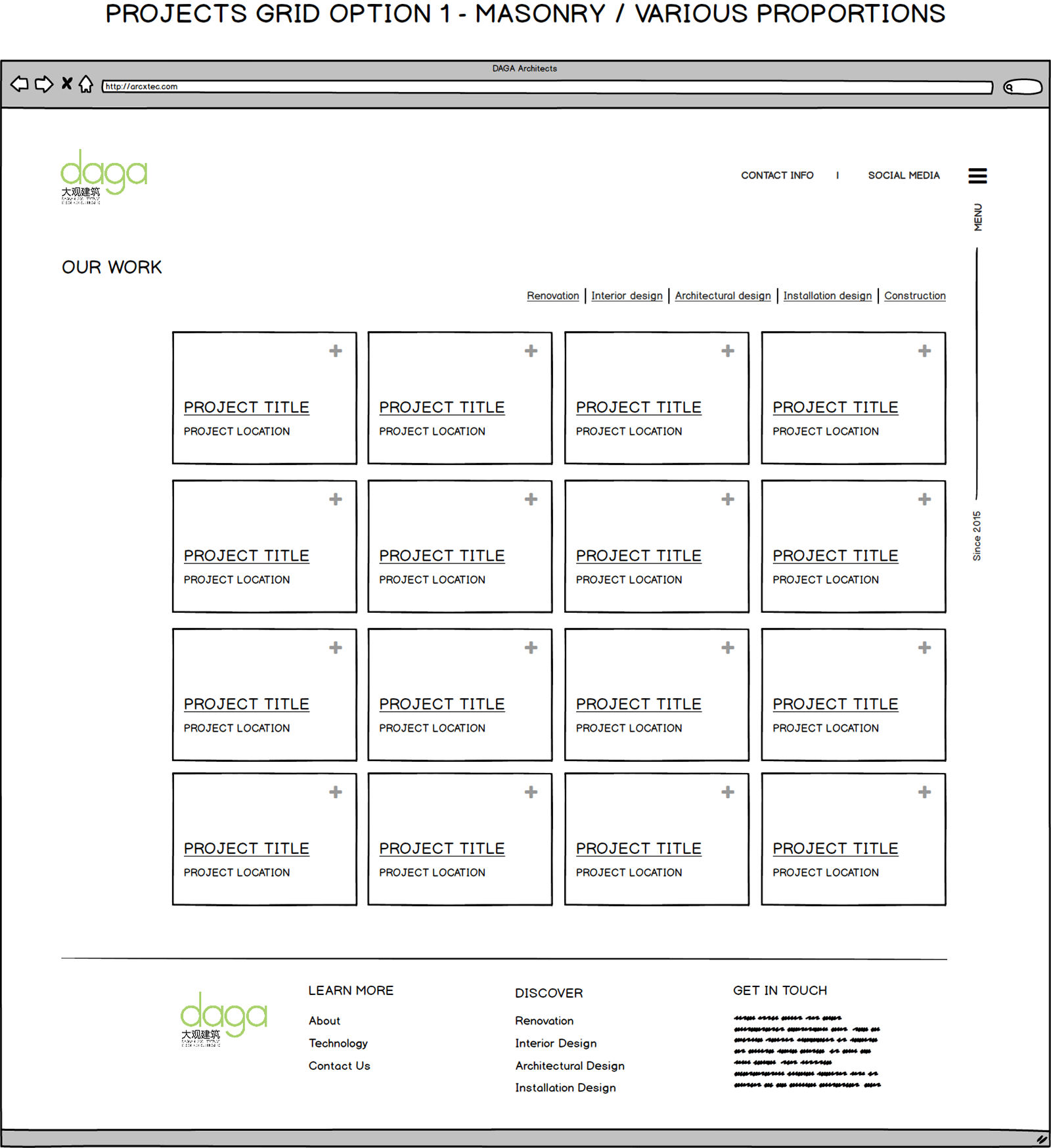
Creating wireframes allowed me together with Daga to visually organize all content into a clear and intuitive structure. It helped prioritize user needs by mapping out the hierarchy before diving into UI design.
Design iterations
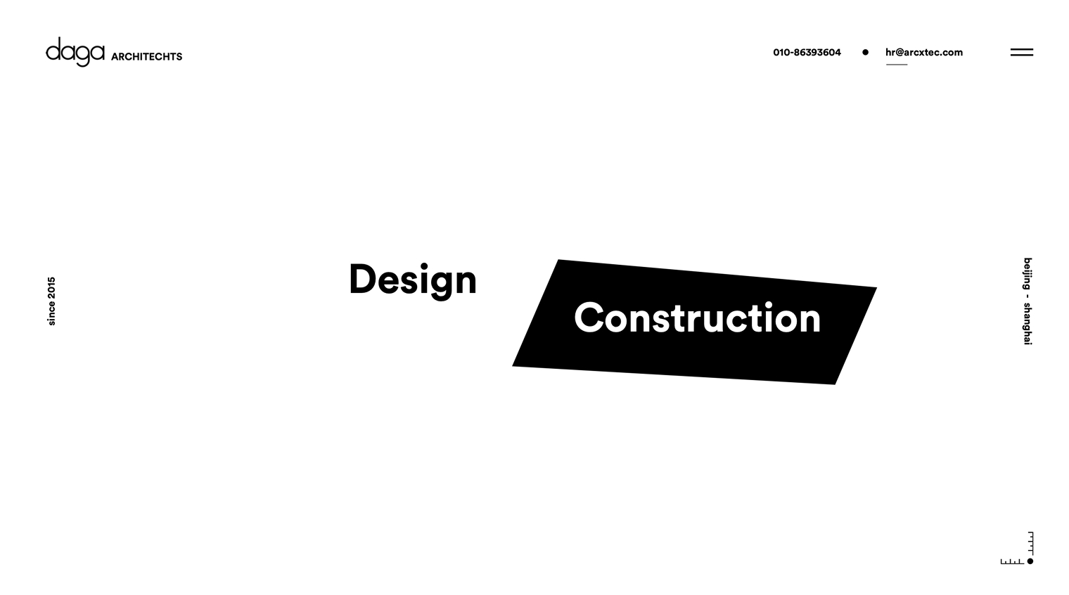
I worked closely with client X to develop a web design that evolved through a structured, iterative process.
Each iteration was tested and evaluated to incorporate feedback and refine usability and aesthetics.
After three focused rounds, we achieved a final design that aligned with the project’s goals and user expectations.
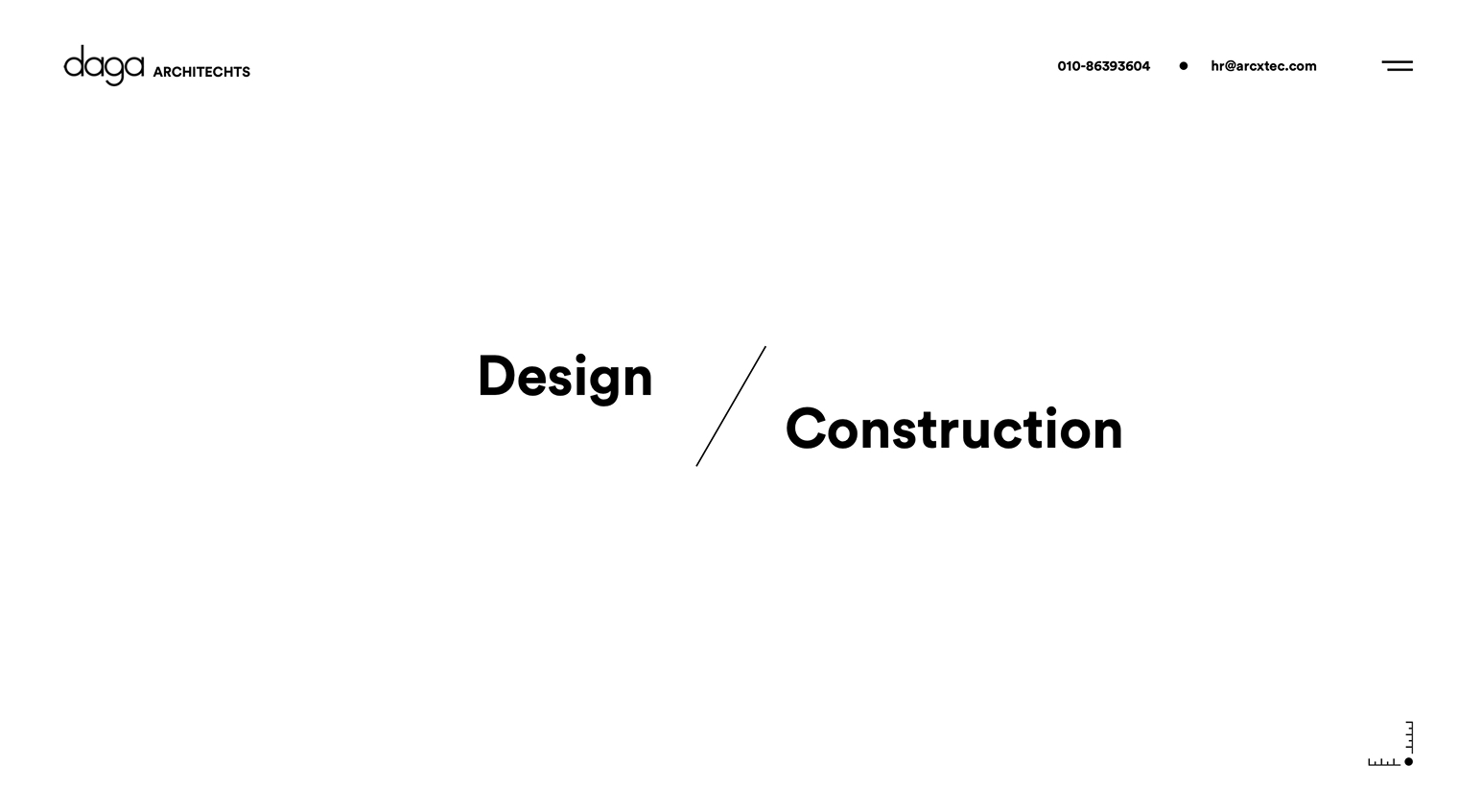
Why didn’t the following design direction work?
Participants reported that the plain, typography-focused style didn’t reflect Daga’s bold identity as a multidisciplinary architectural practitioner.

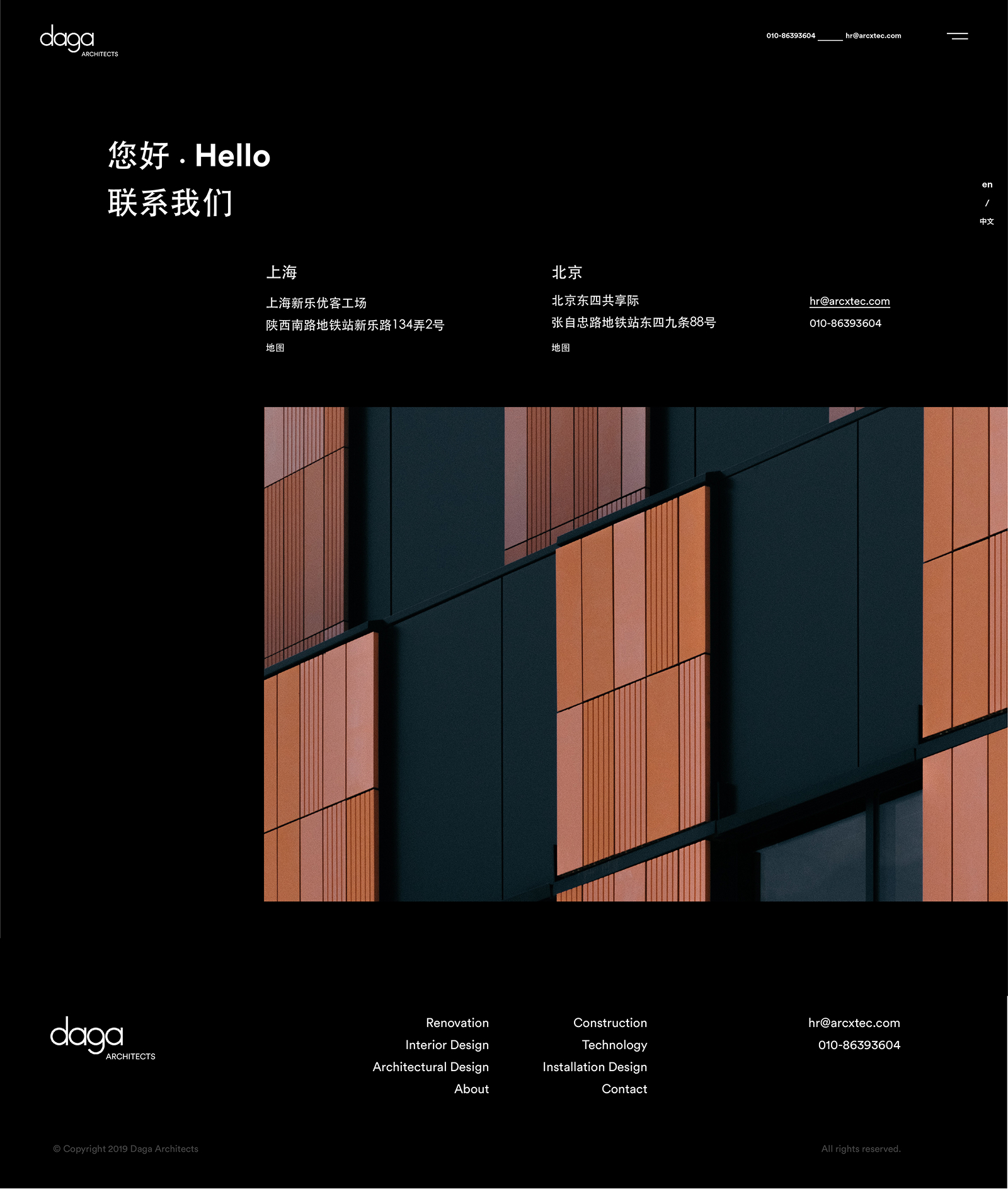
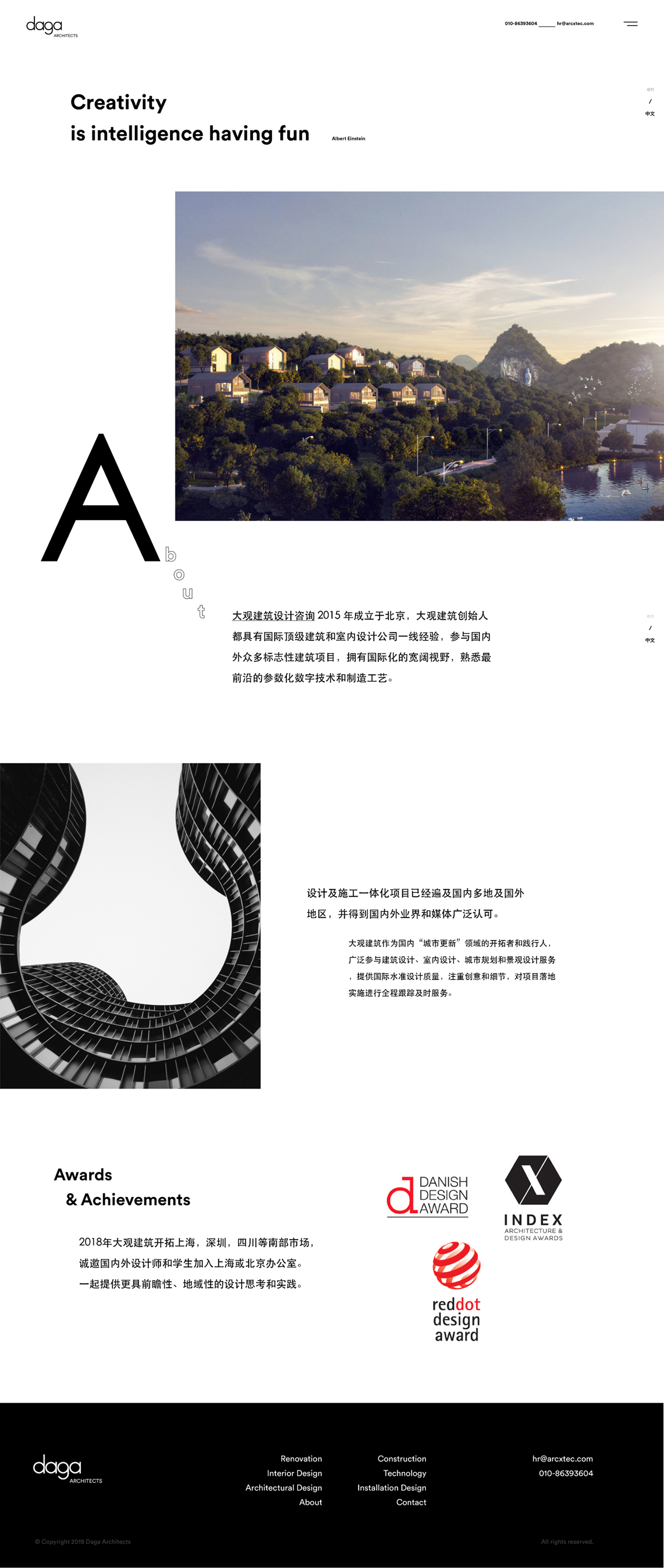
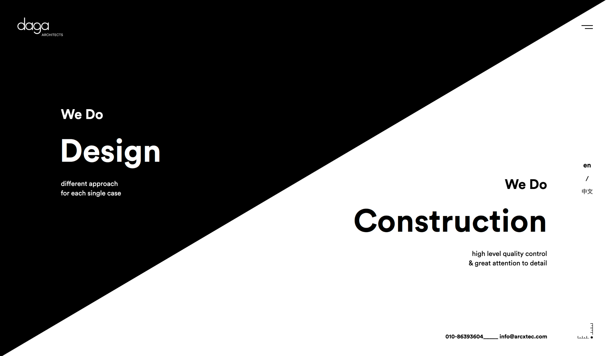
Final design
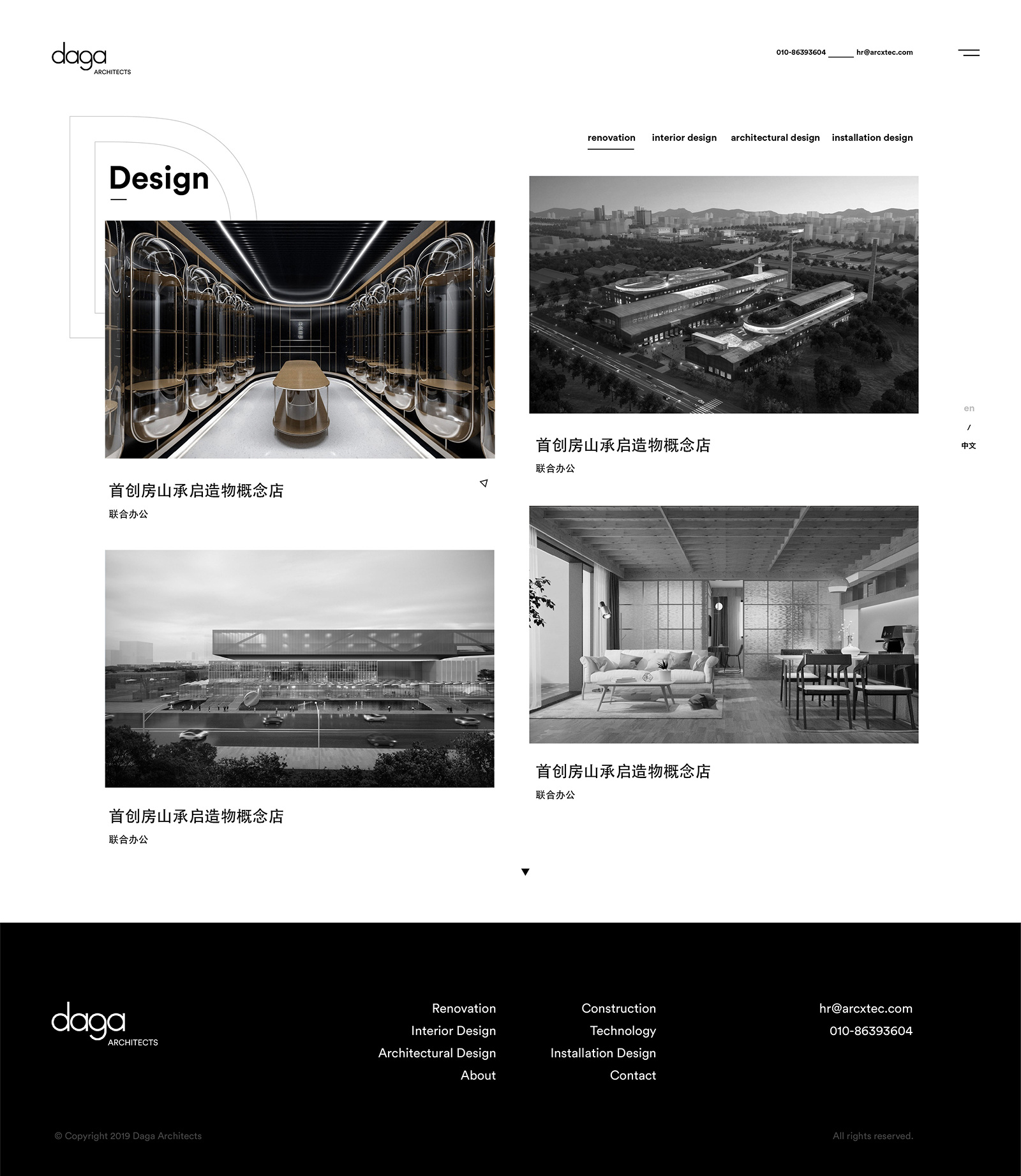
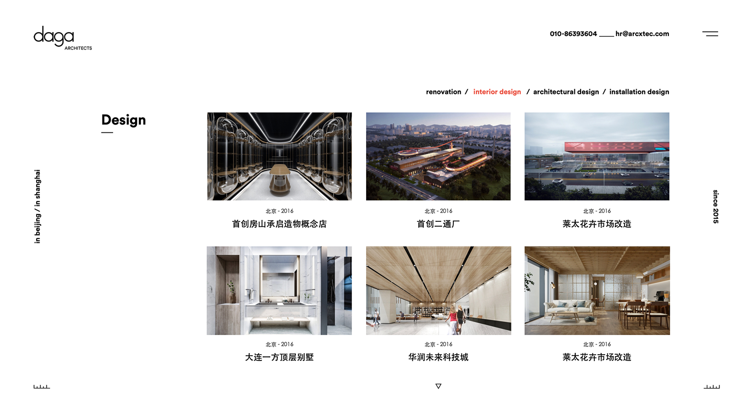
The final design was well received, especially the redesigned “Work page” featuring larger, high-impact visuals.
Showcasing projects more prominently helped communicate the quality and diversity of Daga’s work at a glance.
This approach resonated with a broader audience, making it easier for users to understand Daga’s capabilities and style.