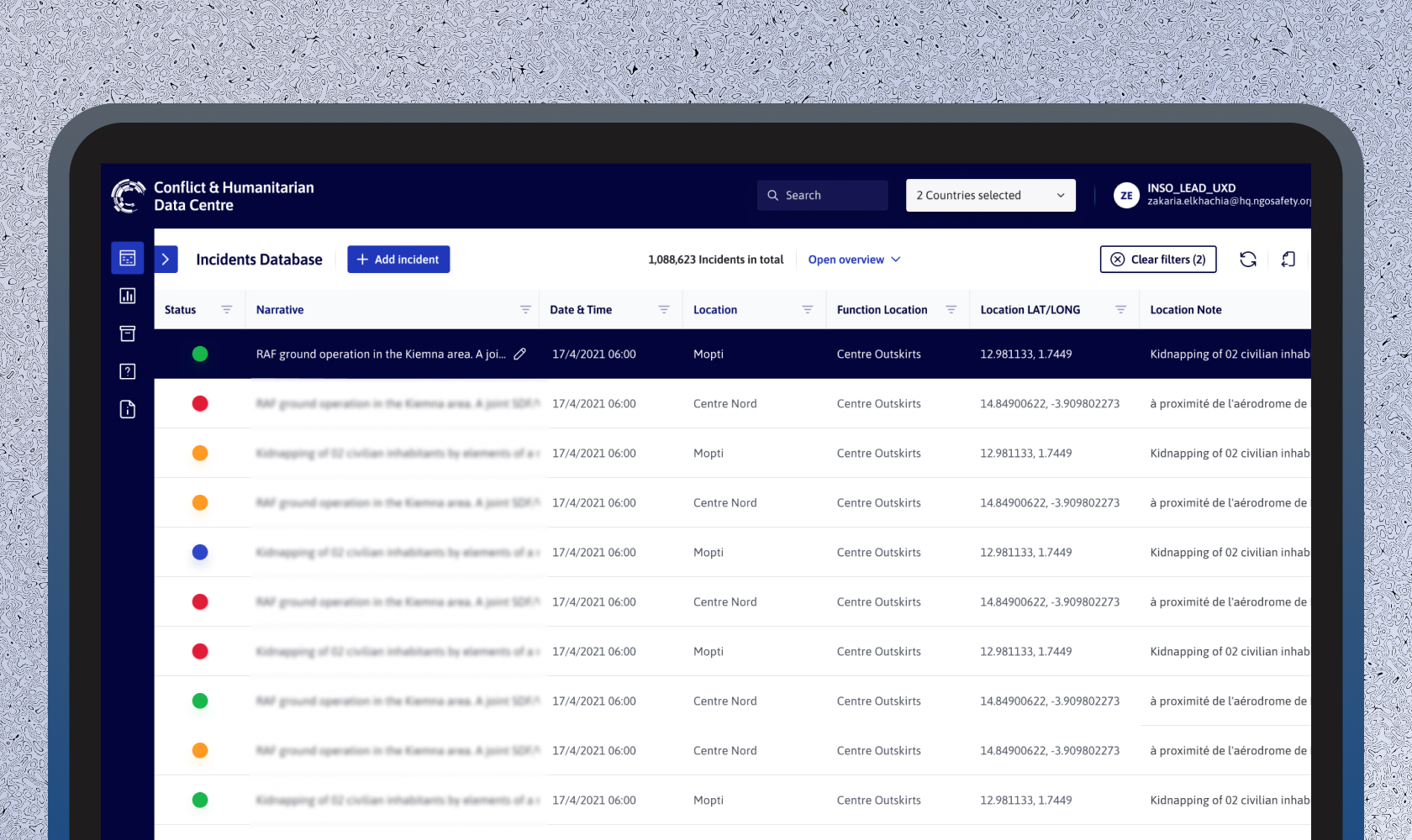
Background and context
The Conflict & Humanitarian Data Centre (CHDC) is INSO’s incident database platform used across 22 countries. It helps humanitarian organisations and analysts monitor conflict trends, assess threats to aid workers, and produce timely, context-specific analysis.
CHDC had grown in value and scale but had serious usability issues. The original design was created around 2016–2017. However due to different challenges, the first version wasn’t completed until five years later. By the time it launched, both the UI and UX were somewhat outdated, misaligned with modern expectations, and inconsistent with INSO’s updated brand style.
I wasn’t officially tasked with a redesign. The initiative began when I created a UI draft inspired by INSO’s new brand guide (a separate project I led with the communications team). That draft gained traction, and the redesign quickly evolved into a broader UX improvement project involving:
- UI revamp using the new INSO brand style
- Improved navigation and readability
- Enhancements to critical flows like filtering and incident insertion
- New onboarding via in-app video tutorials
- Better visibility of incident data and more specifically impact data
Understanding the problem
Although we had limited analytics before the redesign, Microsoft Clarity gave us useful heatmaps showing the most used elements on CHDC’s front page, the data table.
Commonly clicked elements included:
- Incident filters (3,5,6 on the visual below) – location, status, date/time
- Filter reset (4)
- Export (12)
- Add incident (1)
- Left sidebar (13) – Reset selected incident and go back to incidents overview
- Data table refresh (7)
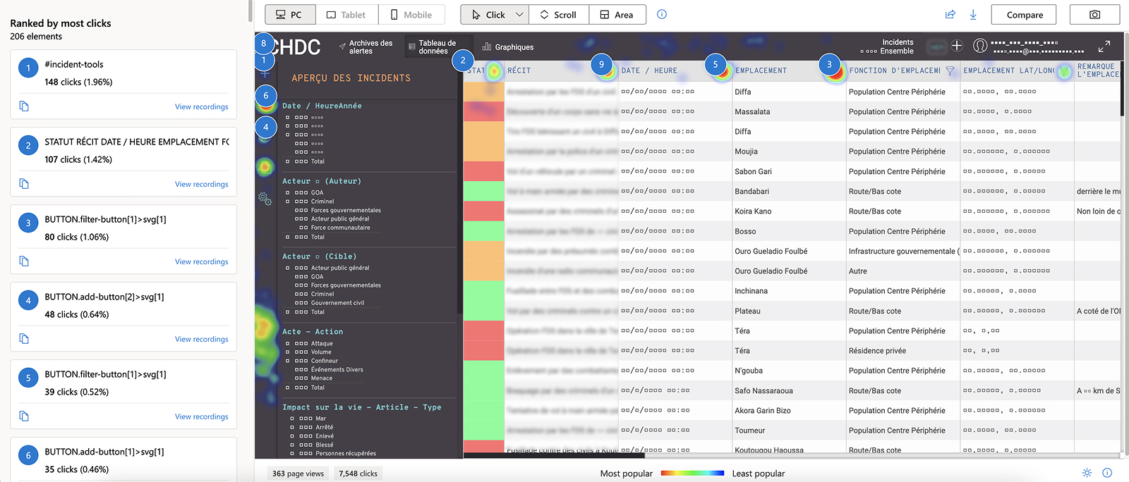
Heatmap of frequently used/clicked features/areas. (tracked and generated using MS Clarity)
Using MS Clarity session recordings, we could also observe users when facing challenges in accomplishing certain tasks and we could also list out a number of rarely used or confusing features. This included:
- Overview sidebar took up too much space and wasn’t frequently consulted.
- Users would sometimes click by mistake on the wrong status indicator to change the status of an incident. This happened mostly when there was a stack of incidents with similar state colour.
- Syncing data in the table available through the user dropdown menu.
- Wireless icon representing a mode called “offline” which wasn’t used as expected. The necessity of this feature wasn’t researched prior to its implementation.
- Help section available only through the user dropdown menu.
- About CHDC available only through the user dropdown menu.
- Alert archive – Not relevant anymore since the release of the INSO Alert Mobile App (which is a separate project showcased here).
- Full screen toggle.
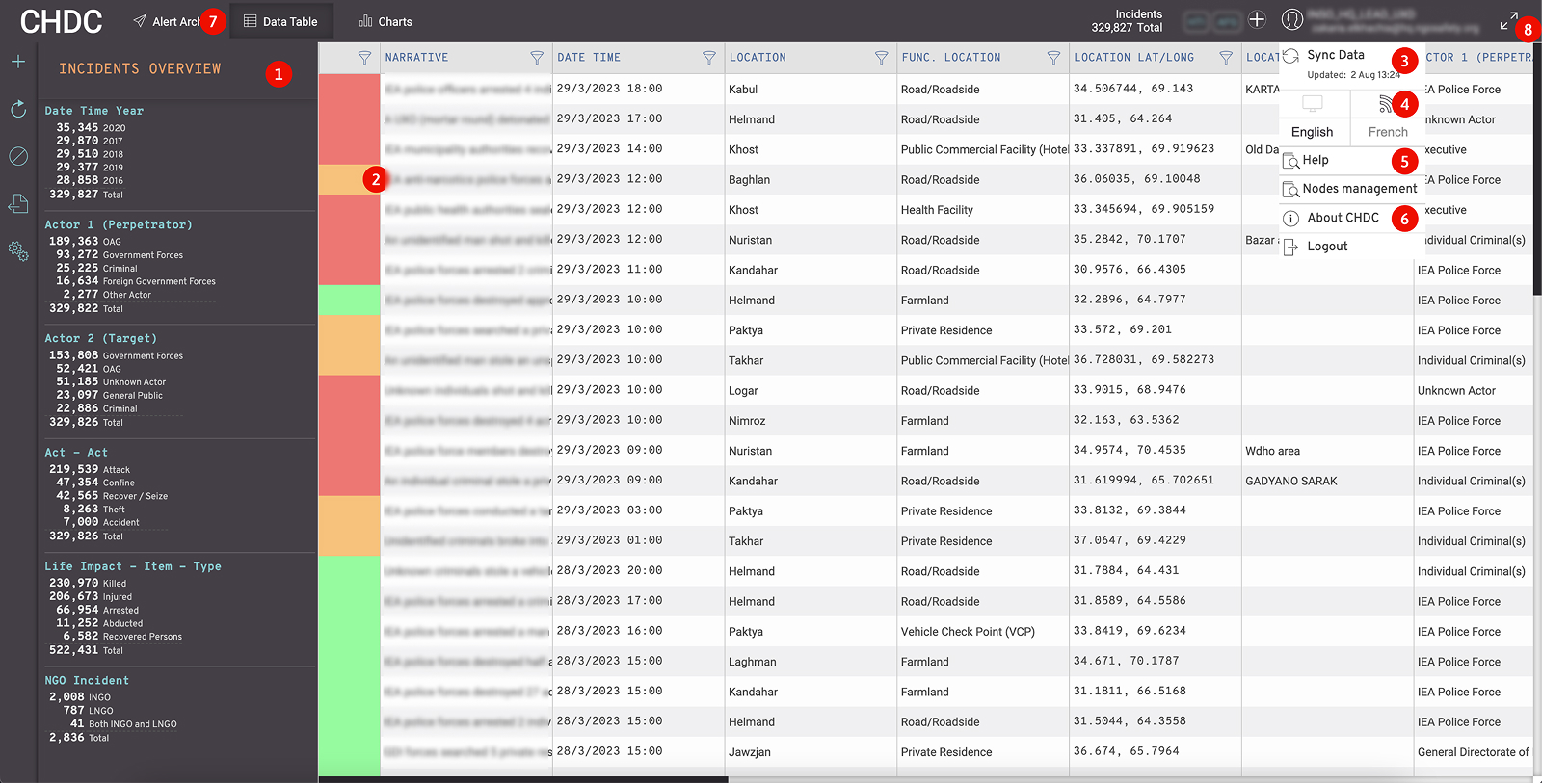
User challenges & rarely used features
Some of the most visible problems were not captured in analytics, but emerged through internal feedback. For example:
- New users often didn’t know how to use CHDC
- Navigation was confusing and often ignored
- Users struggled to locate key impact data
These helped shape our UX direction.
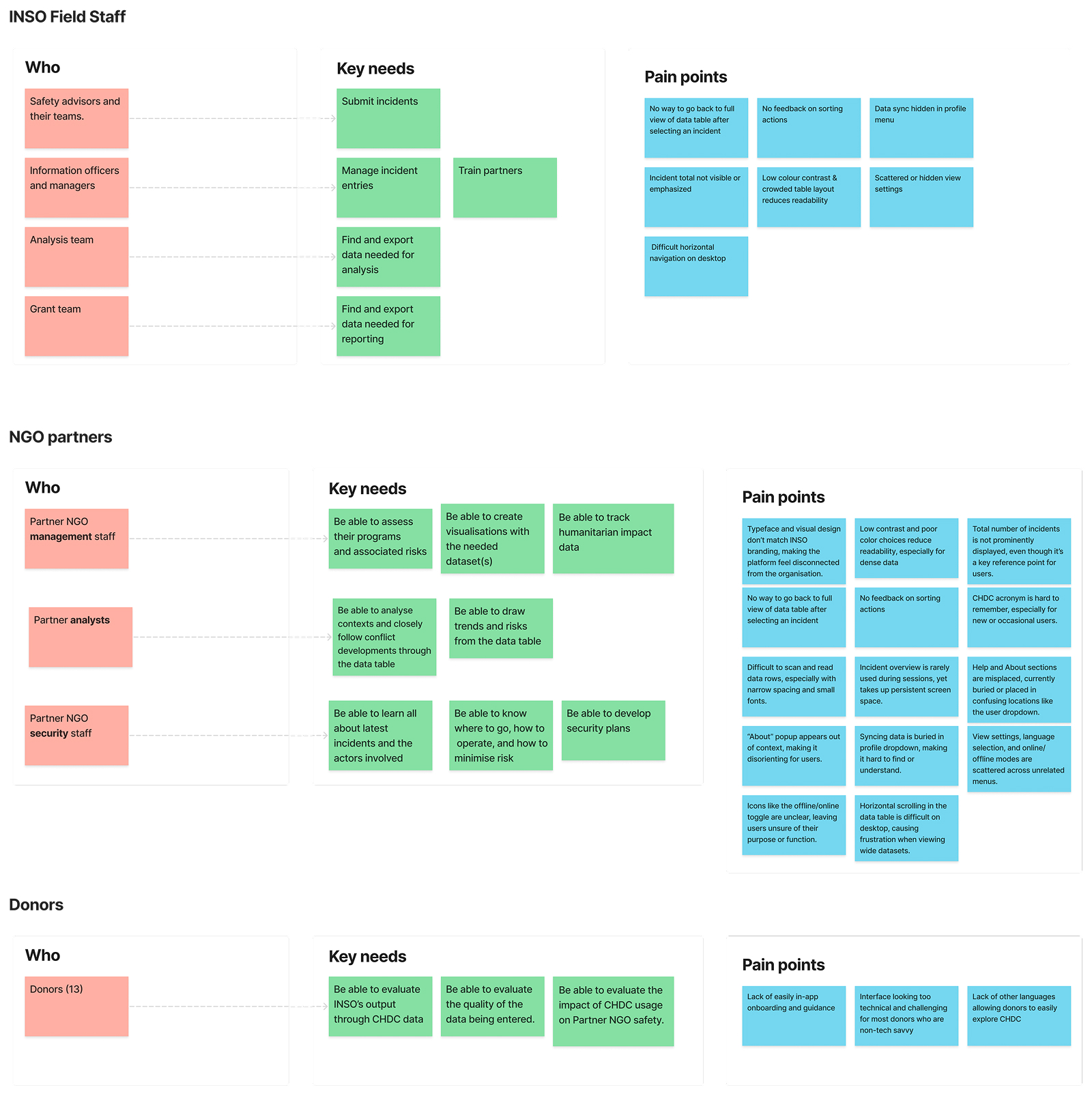
UX challenges, ideation and direction
I collaborated closely with INSO’s Information Team, see as the main admins and managers of CHDC, along with other colleagues who regularly engage with NGO partners and donors. Together, we transformed insights into actionable design questions and generated solutions to test (see visual).
Some of the prominent challenges:
- How might we improve first-time user understanding of CHDC?
- How might we reorganise the interface around the most used actions?
- How might we present the incidents overview in a more useful and scannable format?
- How might we align the UI with INSO’s updated brand while maintaining usability in field contexts?
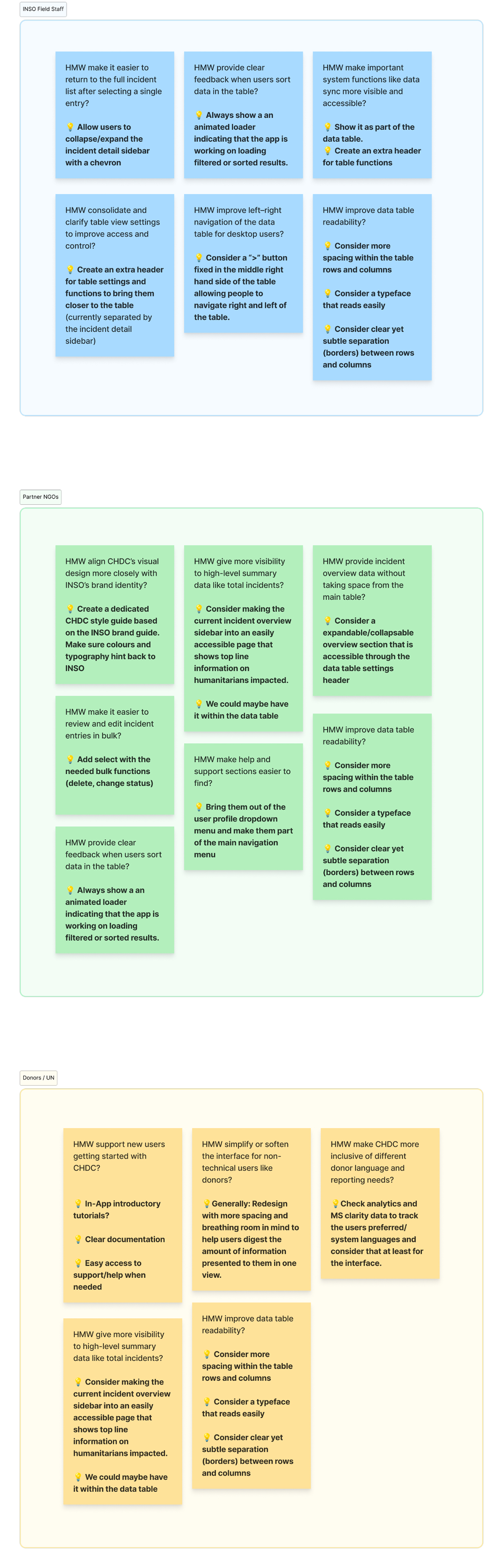
Challenges and their selected ideas by user group
Walk-through the main design updates
The updated UI focused on aligning CHDC with INSO’s brand system while making the interface cleaner, easier to scan, and more task-focused. Below are some of the key changes:
Navigation & Data table actions repositioned
The top-level navigation was rarely used, so we moved it to a vertical menu on the left. This freed up horizontal space for the data table and gave the interface a more app-like structure. The menu is now collapsible, allowing users to focus more on the data.
Similarly core actions like “Add Incident,” “Export,” and “Reload” were scattered or hidden in menus. We brought them together into a new table header above the incident list, grouped with incident count, filter feedback, and settings.
Location of the main navigation menu in the former design
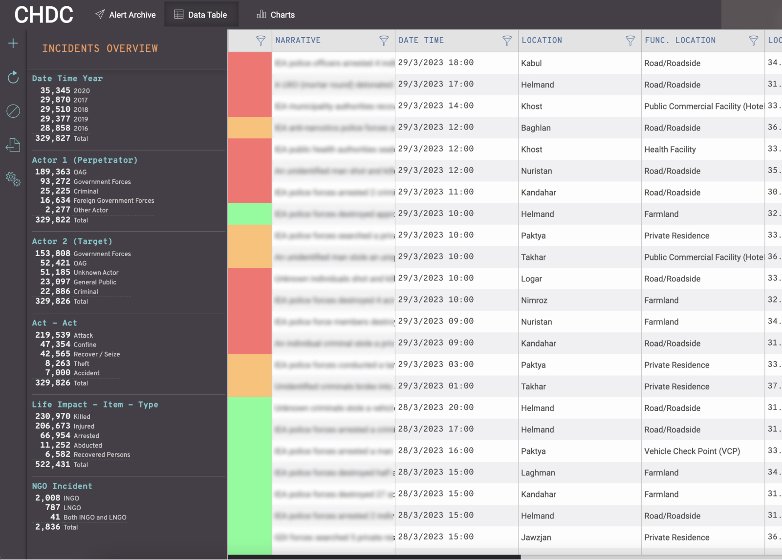
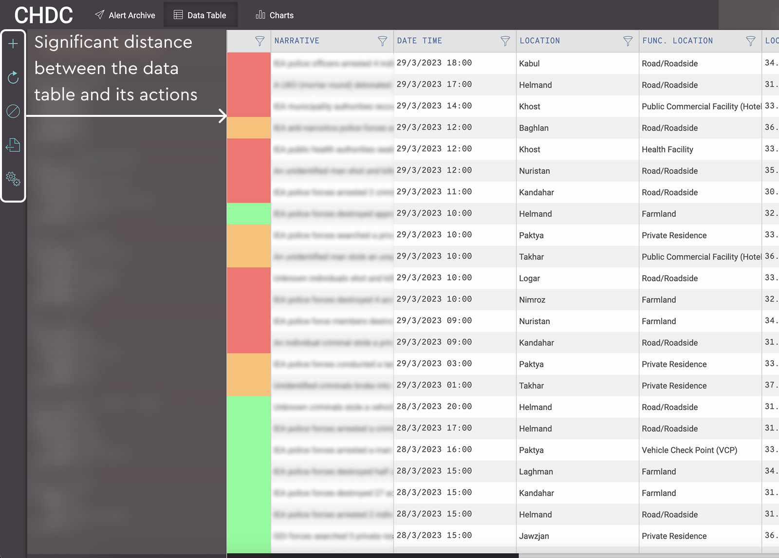
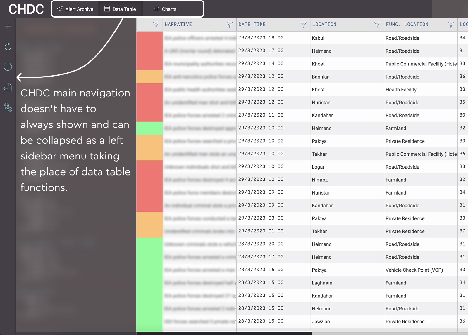
Location of the main navigation menu in the current design
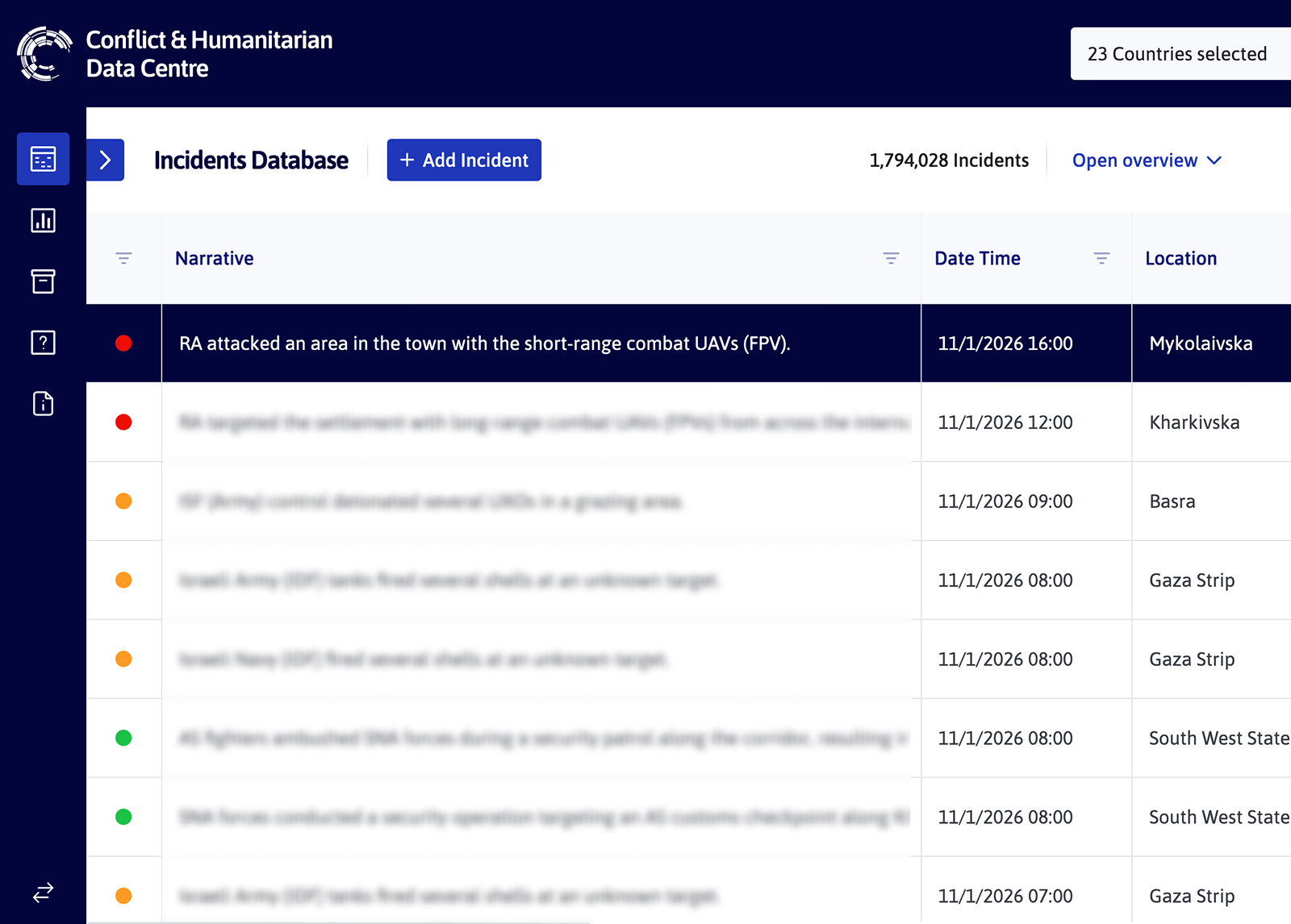
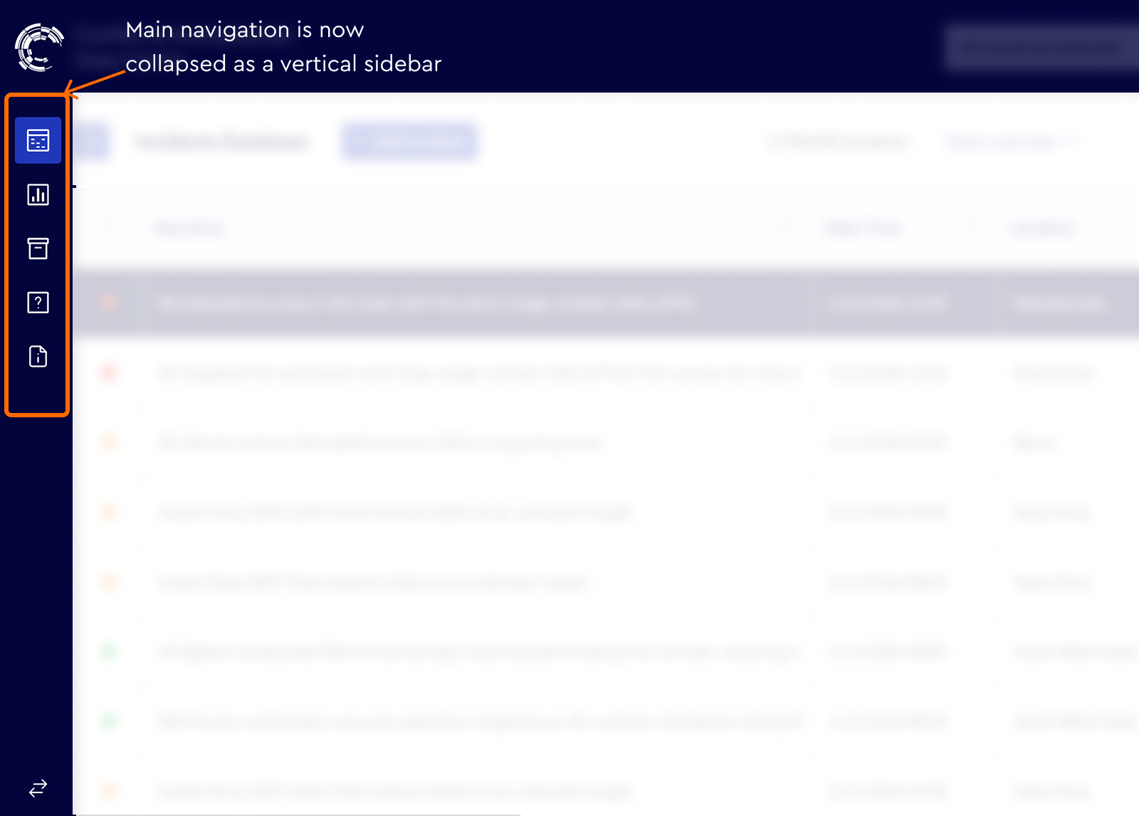
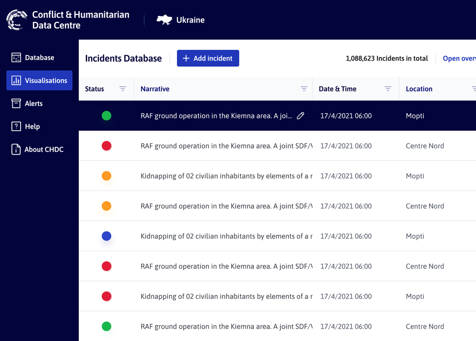
Table layout improvements
The former table design focused on fitting more rows per screen to reduce vertical scrolling, but this made the interface feel dense and overwhelming — especially for less tech-savvy users. Many struggled with the unintuitive horizontal scrollbar and often preferred exporting the data to view it more comfortably.
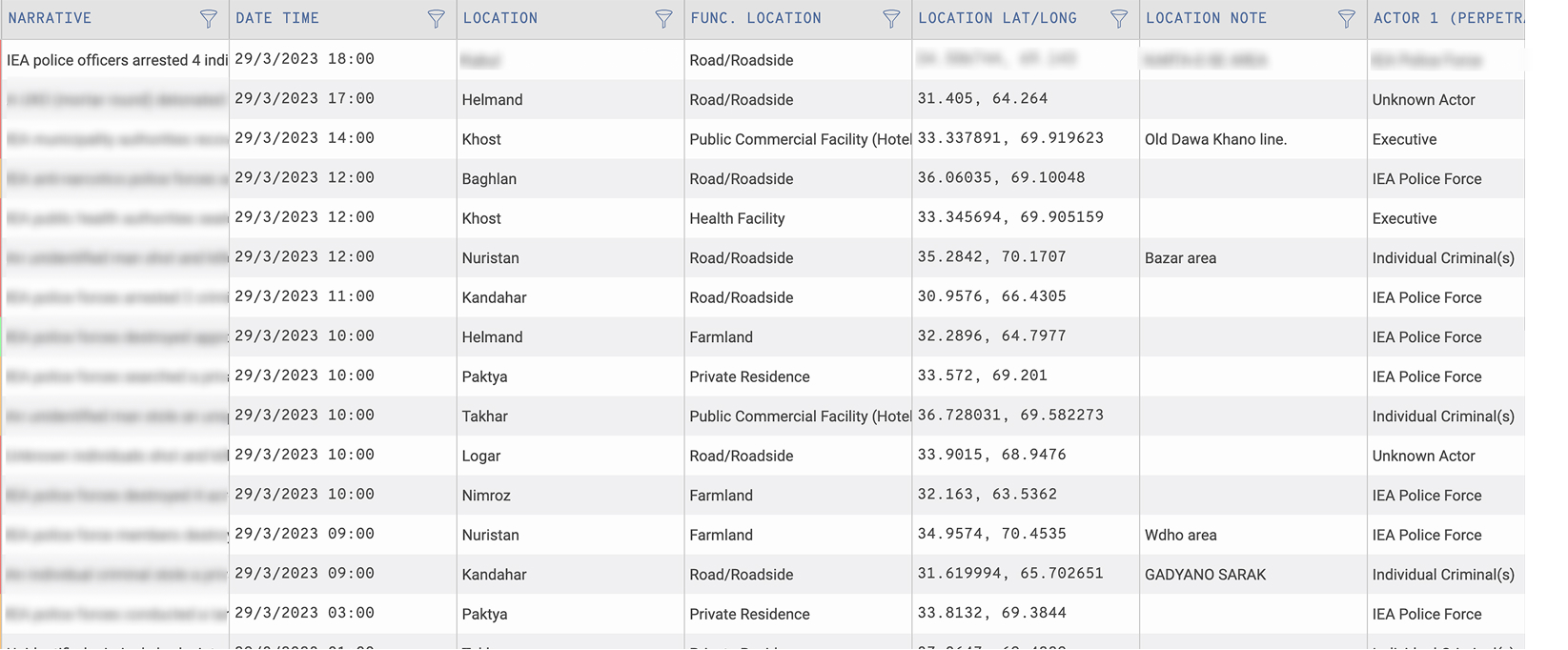
Data table – former design
In the redesigned version, we introduced greater spacing between rows and columns, improved readability with clearer contrast and typography, and added a fixed horizontal scroll button to make navigation easier. These changes made the interface feel more approachable, helping users focus on digesting the content of each incident row.
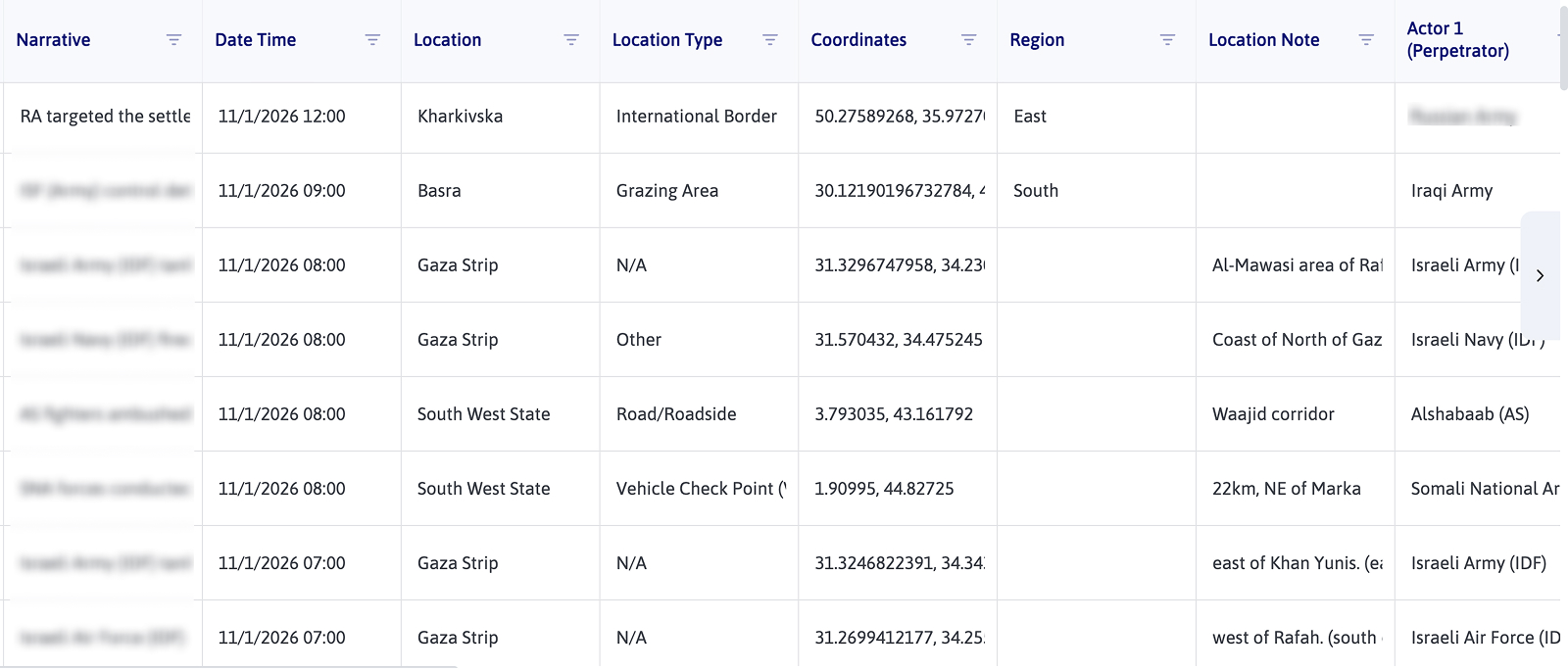
Data table – updated design
Incident status redesign
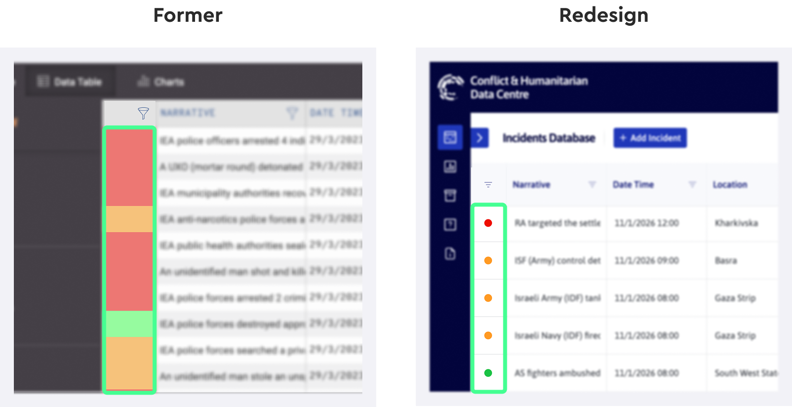
Previously, statuses like “Incomplete” or “Verified” were shown in colored blocks that felt too cramped and took more horizontal space from the table than it needed. We switched to compact colored indicators with padding around them, which improved legibility and made it easier to visually group incidents by status.
Programme selection clarity
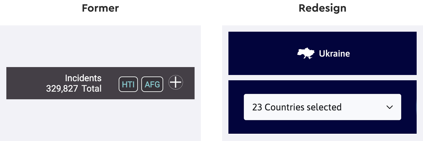
In the old version, selected country programmes were shown in multiple tags, often taking up too much space. We simplified this by showing a single selected programme by name, or a count of selected programmes when multiple are chosen — using a standard dropdown menu for clarity.
Reworking the incidents overview
The incidents overview used to be a fixed sidebar, which took up space even when not needed. Now, it’s accessible via a button and opens as a modal overlay. This lets users view more detailed incident summaries without cluttering the main interface.
Former design
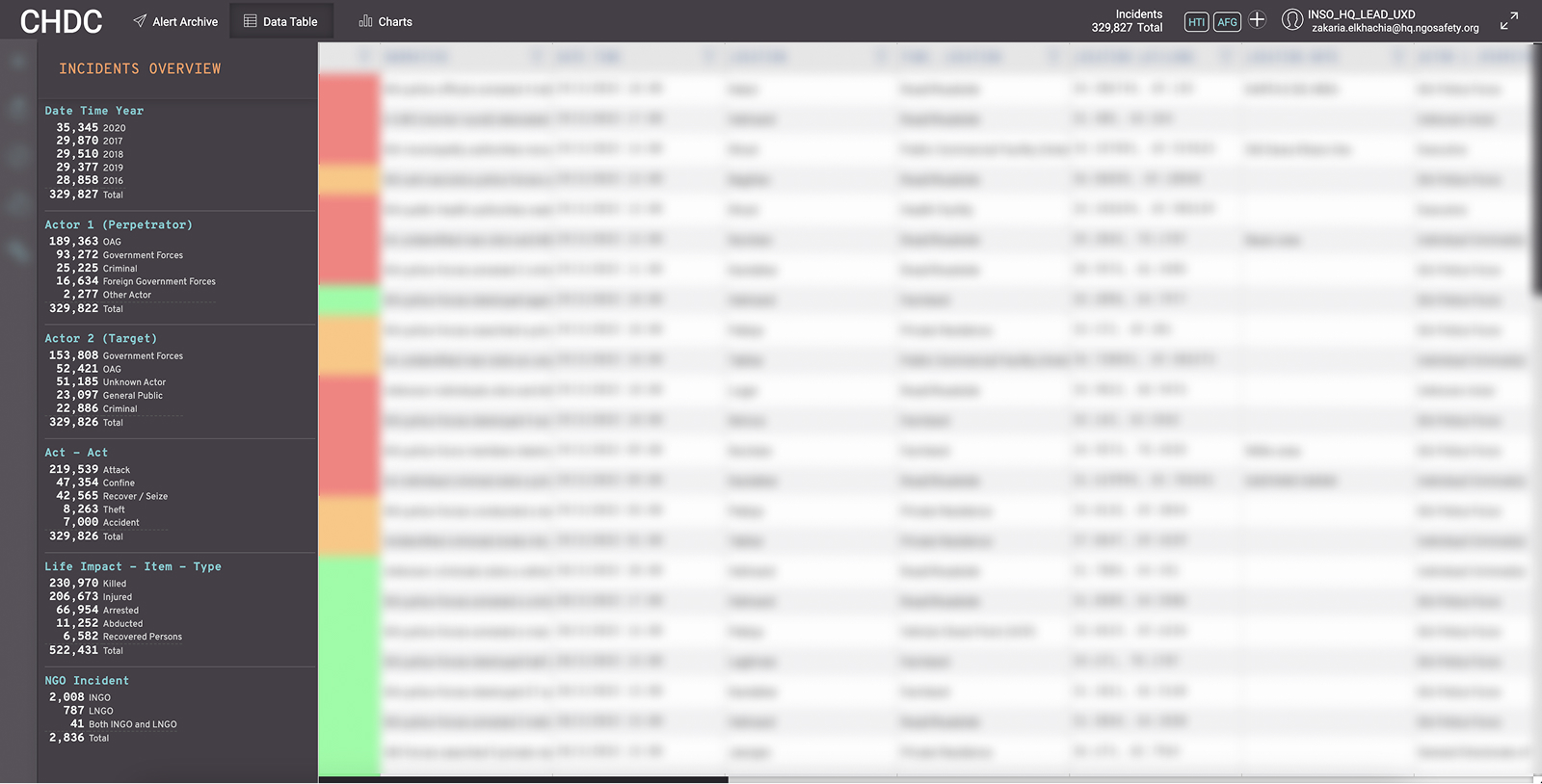
Incident overview – Former design (taking up sidebar space)
Redesign
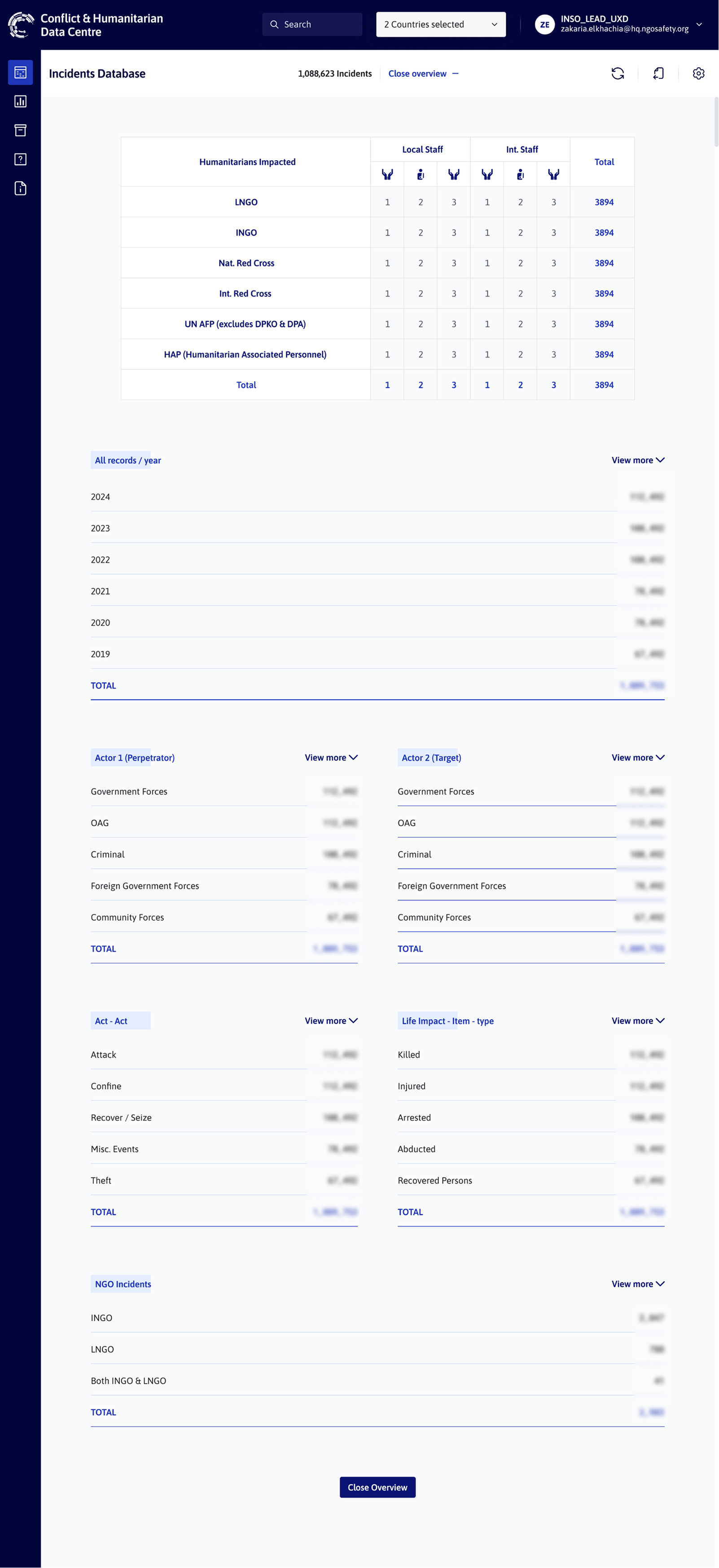
Incidents Overview Redesign – Accessible through a button available on top of the incident table.
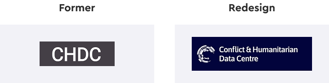
Clearer branding
Instead of the acronym-only logo, we displayed the full name — “Conflict & Humanitarian Data Centre” alongside the logo in the header section (as shown below). This made it easier for new users to recognise the platform and remember what it stands for.
Brand style and typography
The entire interface was adapted to the new INSO brand system, using official colours, updated iconography, and the ASAP typeface. The goal was to not only unify CHDC with other INSO platforms but also improve overall readability and visual hierarchy.
This wasn’t just a visual update and these changes were aimed at reducing cognitive load, improving information clarity, and supporting faster decision-making.
Redesigning the data visualisation section
The previous “Charts” section was restructured to enhance usability, improve accessibility, and better align with INSO’s visual identity. The focus was on simplifying the creation of meaningful visuals while supporting users with clearer defaults and helpful resources.
Key changes:
- Renamed “Charts” to “Data visualisations” for better reflect the broader scope including maps
- Introduced a new “Visualisations by INSO” section with most-requested charts available by default.
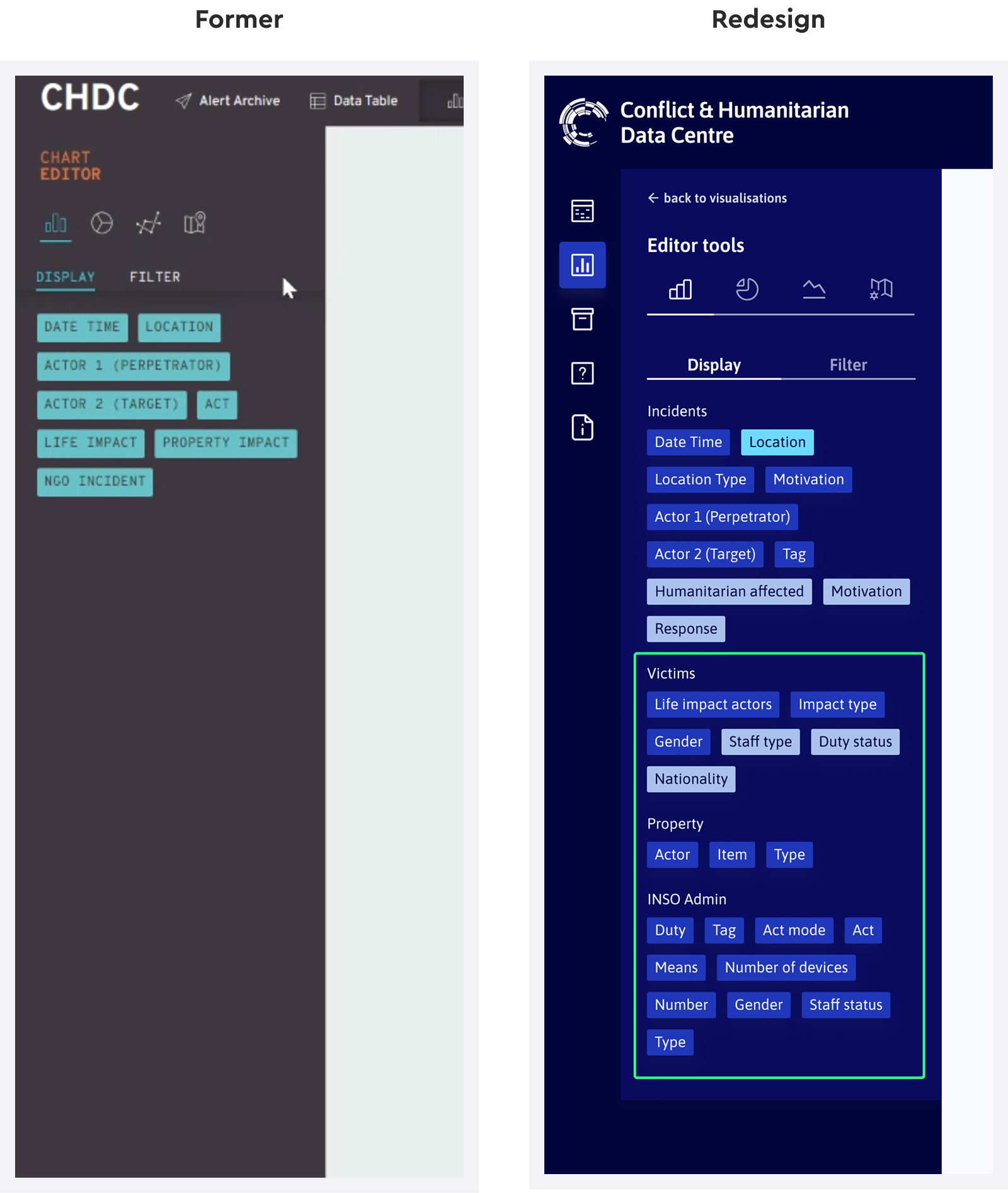
- Added preset visualisation options focused on key impact types, such as victims and property.
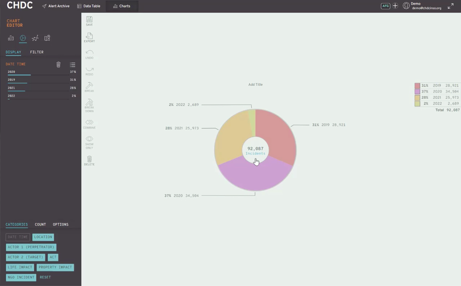
Former pie chart design
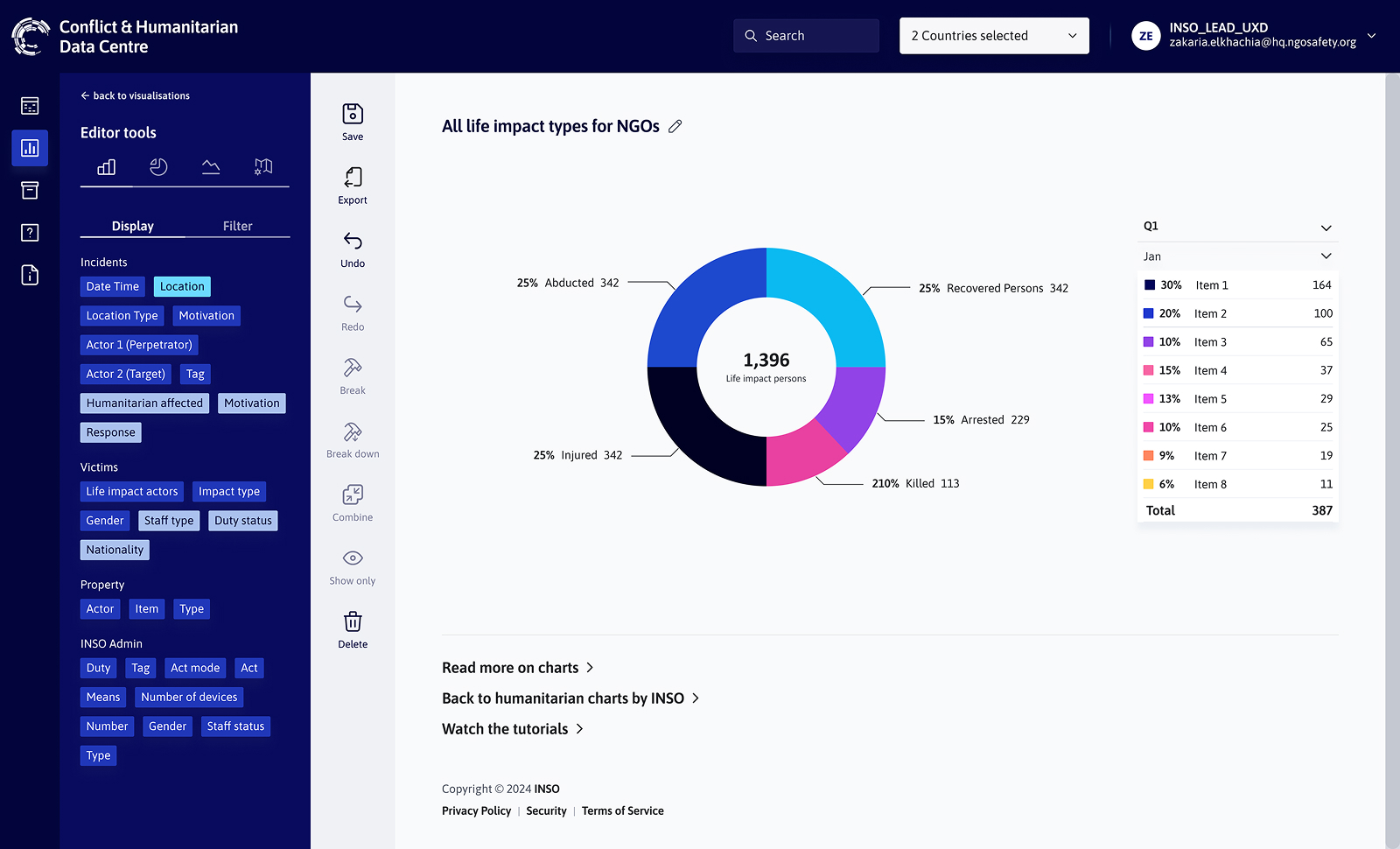
Pie chart design refresh
Documentation & Introductory tutorials
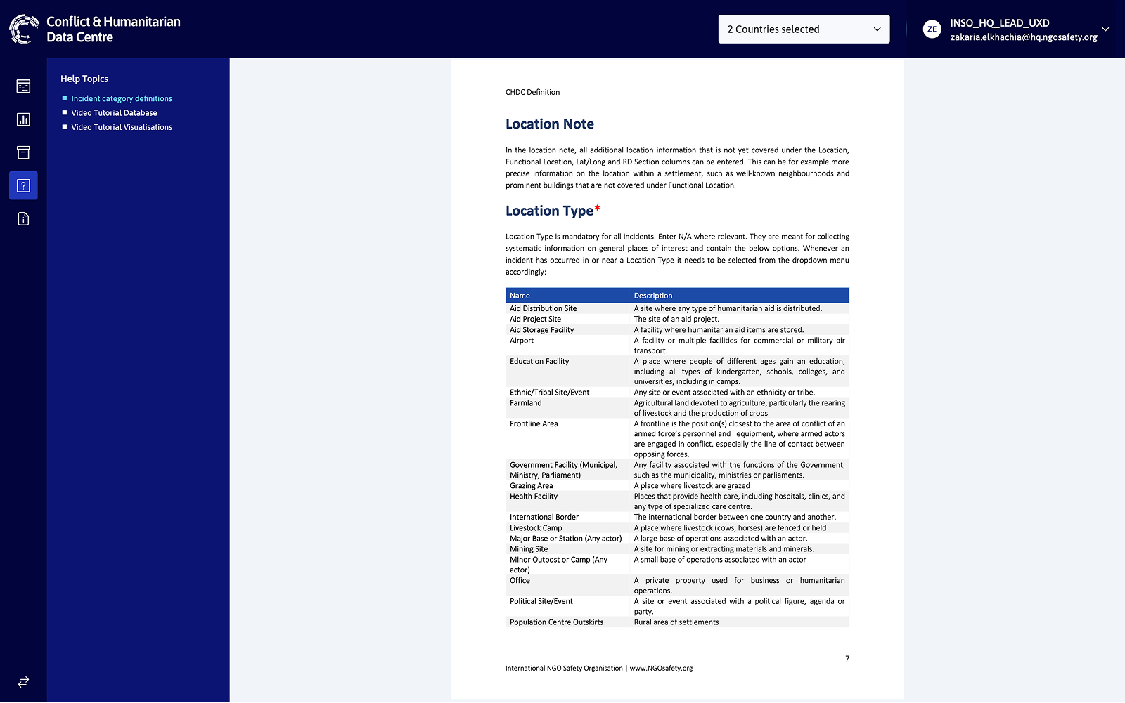
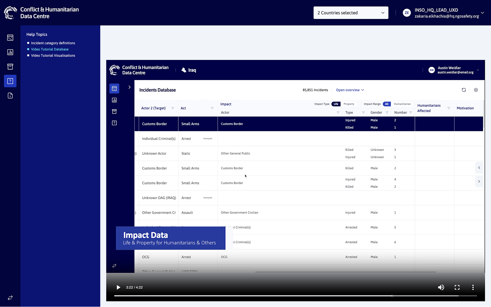
To improve onboarding and reduce user friction, we introduced an online CHDC documentation along with short video tutorials. These walk users through key sections of the platform and explain how to use major features like filtering, data entry, and visualisations. Tutorials are suggested to new users upon login and always accessible via the Help section, making support available at any stage of the user journey.
Explorative concept: AI assistant
To explore whether AI could reduce navigation friction, I prototyped a conversational assistant using Figma Make with the idea of allowing users to query data and generate visualisations through natural language.
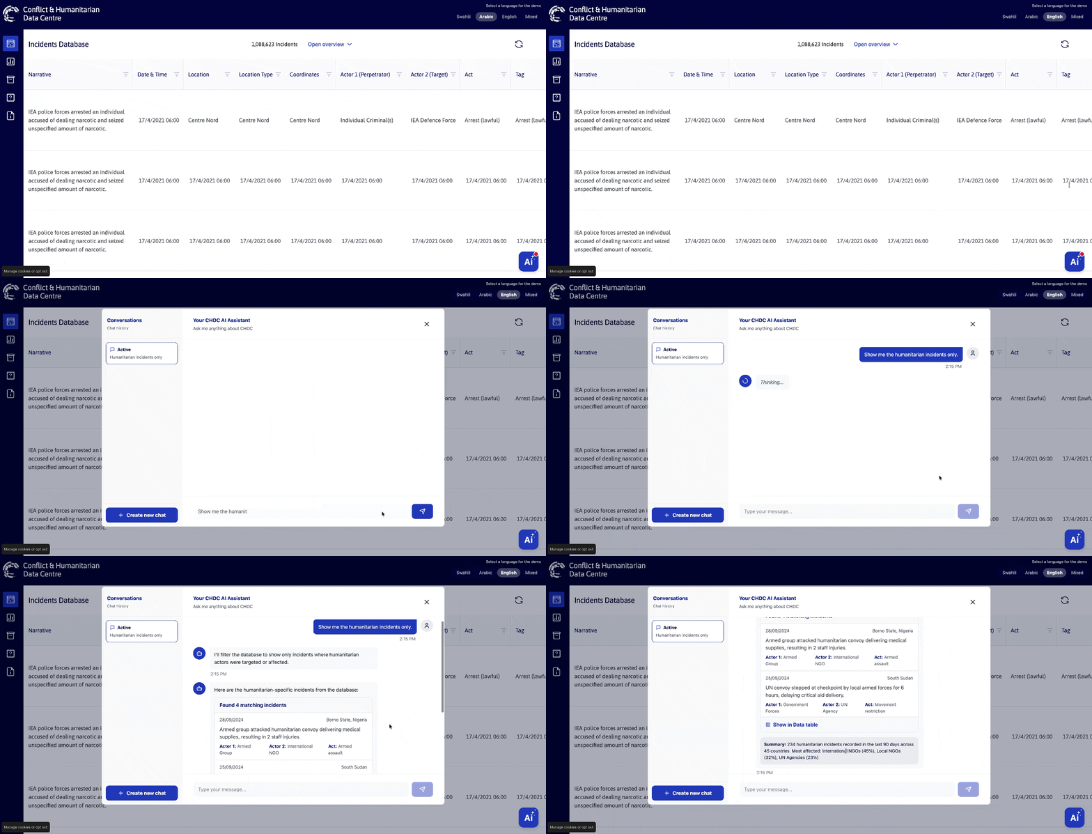
User filters data using natural language: “Show me the humanitarian incidents only.”
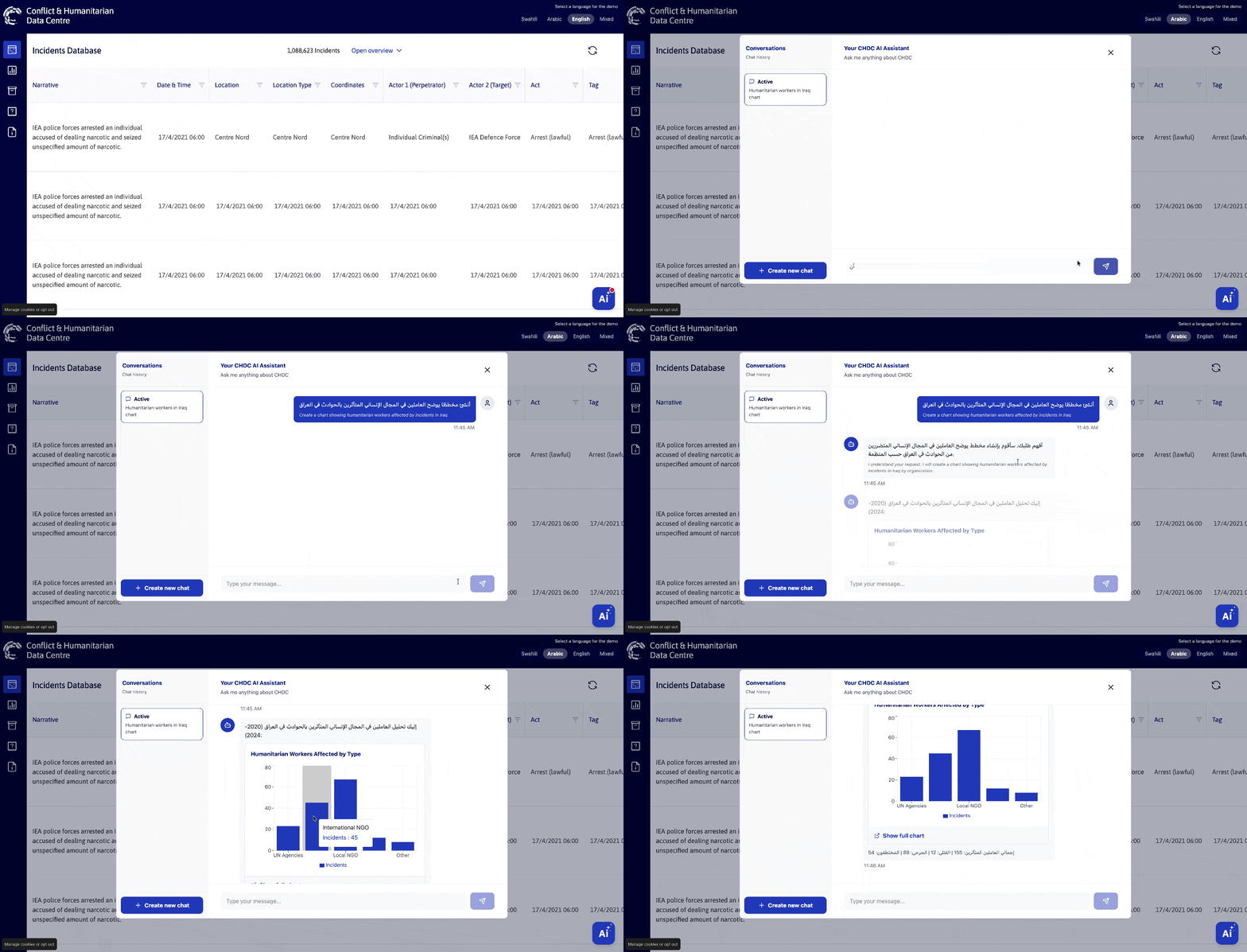
User generates a chart through a prompt(in Arabic): “Create a chart showing humanitarian workers affected by incidents in Iraq.”
Outcomes and impact
Usage data from March 2025 onward shows that CHDC moved beyond initial discovery and into sustained use. Adoption continued steadily over time, with a noticeable uplift following the CHDC launch webinars in April 2025.
In parallel, the number of monthly active users also increased, indicating that users were not only discovering the platform but returning to it regularly.
Together, these trends suggest that CHDC became progressively more embedded in users’ workflows, and that pairing product improvements with targeted onboarding and enablement had a positive impact on engagement.
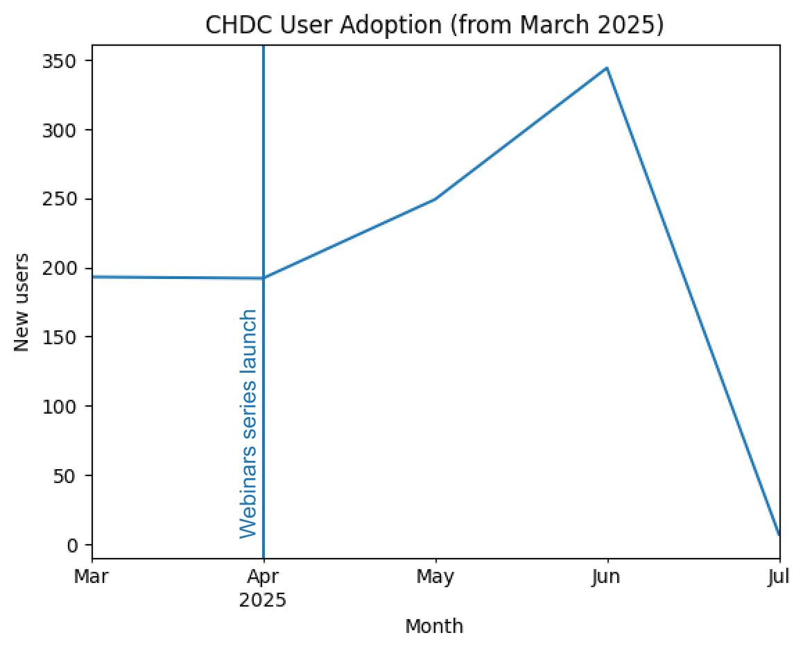
User adoption continued steadily, with a clear uplift following the CHDC launch webinars in April 2025, suggesting enablement played a role in driving uptake.
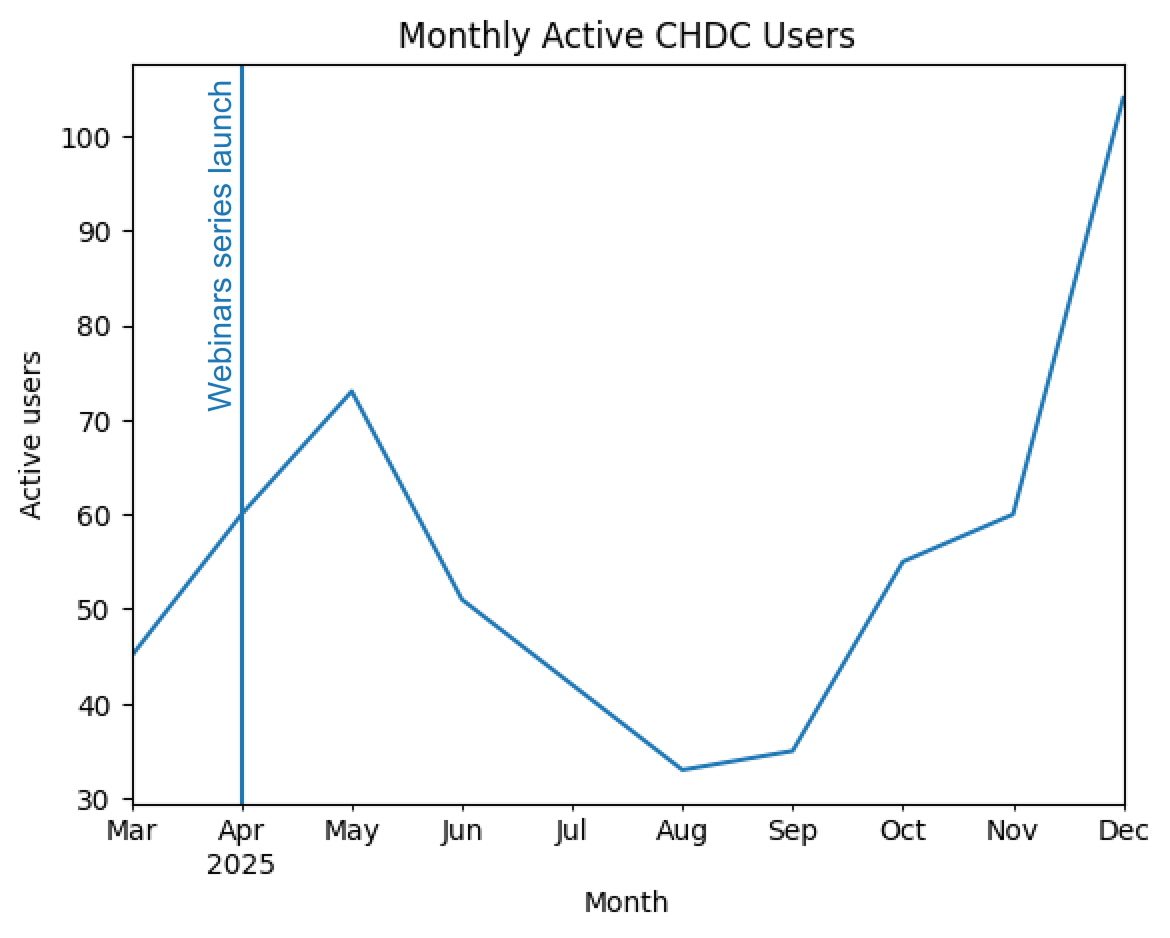
Monthly active usage increased after April, indicating CHDC was not only discovered but increasingly returned to and used over time.
In addition to insights gathered through surveys and webinars, users consistently highlighted the following improvements:
- Faster onboarding for new users
- Less confusion around filtering and navigation
- Easier export and incident insertion
- Improved visual clarity of incident status
- Clearer distinction between humanitarian and property impact
Some improvements are harder to quantify, but have enhanced the platform’s usability for both daily tasks and strategic reporting.
Reflection and takeaways
The CHDC redesign wasn’t commissioned. It started as a UI draft that filled a real gap. That shaped how the project grew and what we were able to achieve within its constraints.
Key lessons:
- Even small interface tweaks (like colour contrast, spacing or filters) can radically improve comprehension
- Working closely with analysts and field staff keeps designs grounded
- Embedding brand identity in UI strengthens product trust
In future iterations, I’d push for more user testing earlier in the process and ideally expand tutorials into contextual help elements.
