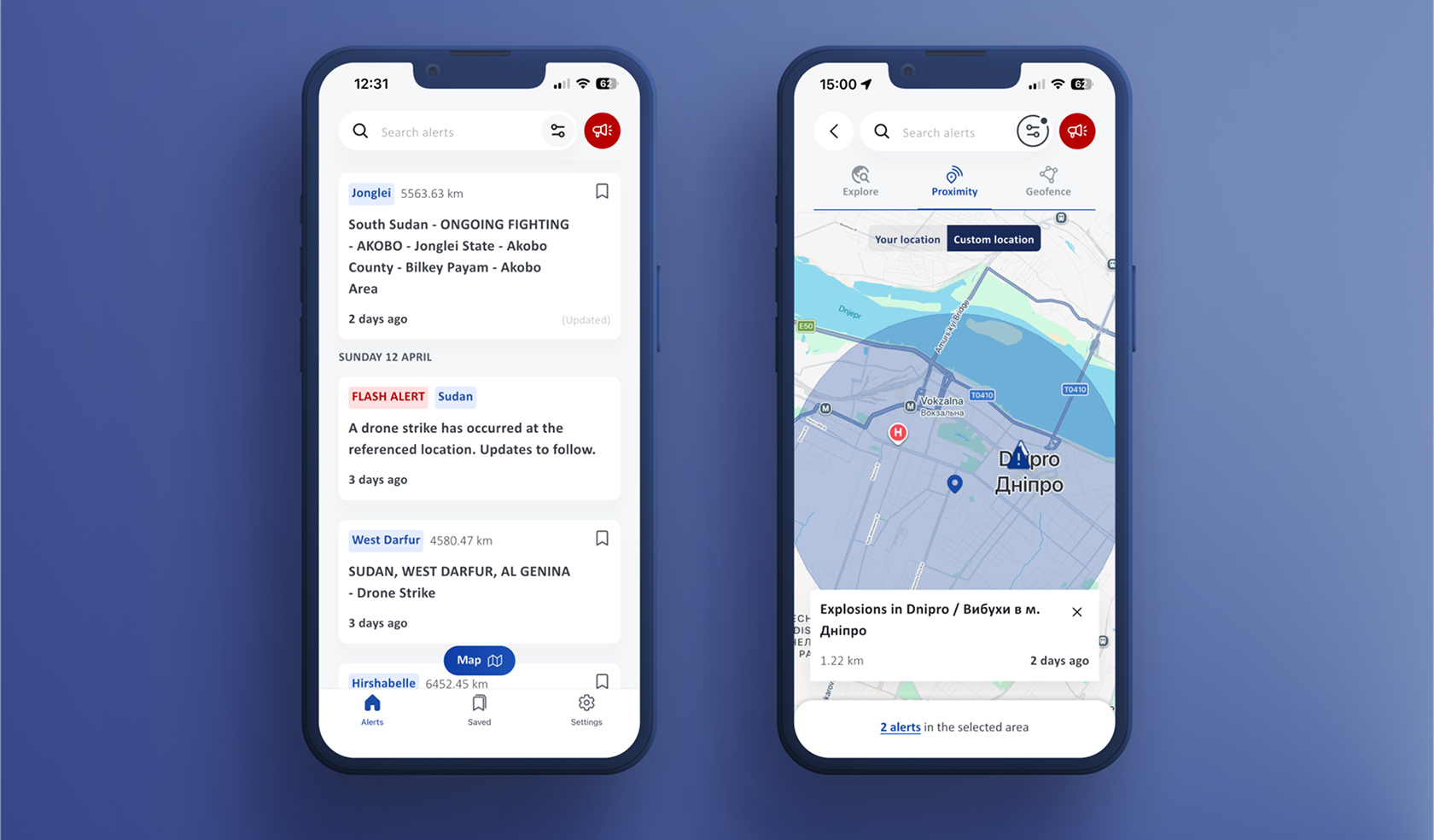
Product
A mobile way to access real-time incident alerts
INSO provides NGO workers with incident alerts in their regions, traditionally delivered via SMS and email. While effective for broadcasting information, these channels are limited when it comes to organizing, filtering, and interacting with alerts in real situations.
High-level overview of the app structure and key interactions around alerts.
The mobile app brings these alerts into a dedicated environment where users can explore incidents on a map, filter what matters, track updates and stay informed while on the move.
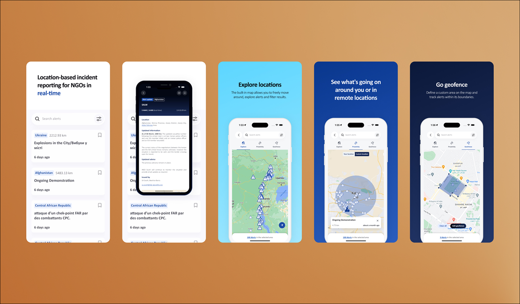
Key sections & features. alert list and the different map modes.
Context
The app existed, but the experience did not match the users or the product’s potential
The app was already in development, with core features in place, but it felt technical and misaligned with users. What started as UI alignment became a broader UX redesign.
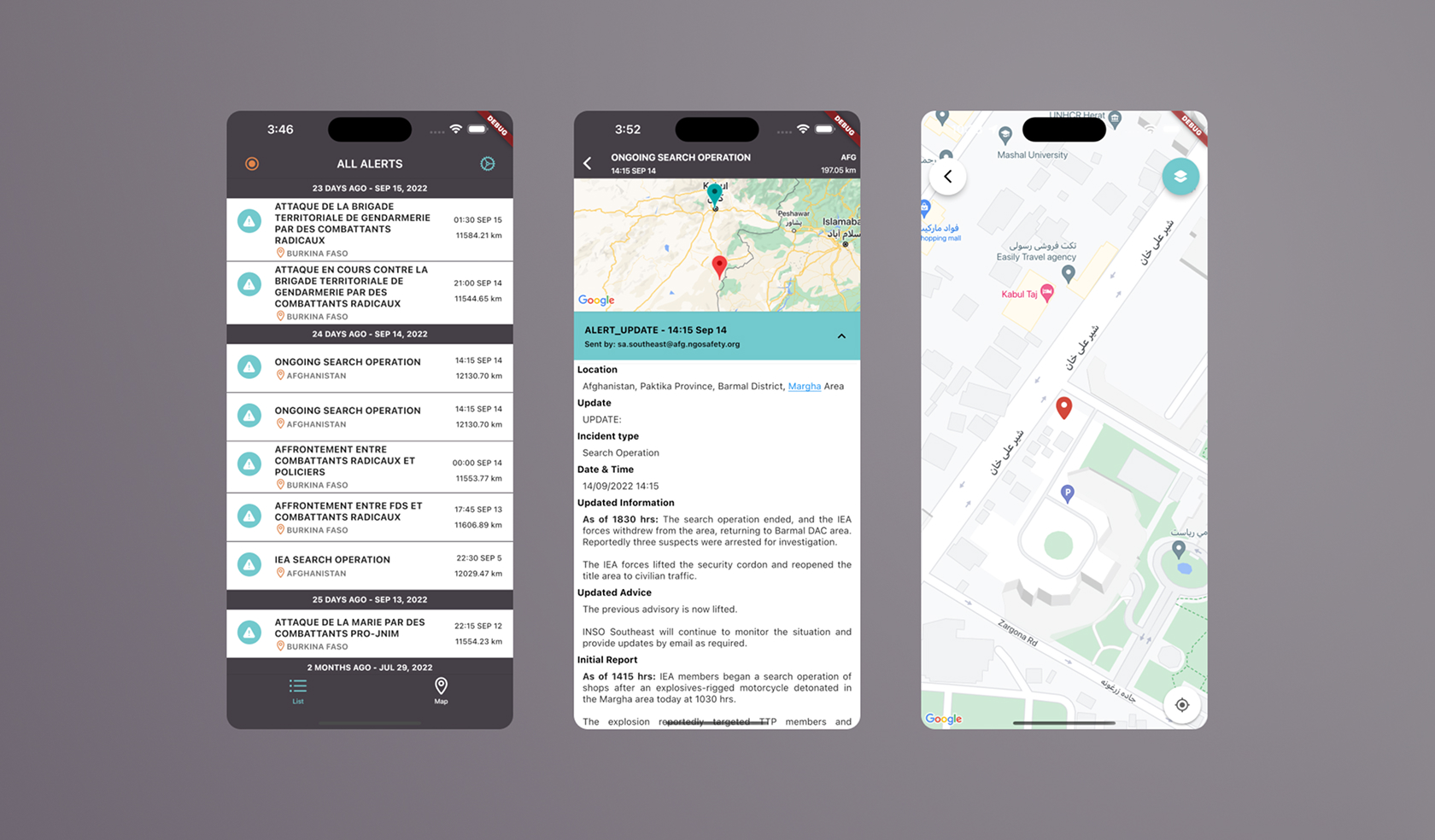
Visuals showing what the App looked like when I joined the project team.
Users
The app is used by NGO field workers, security teams, and INSO staff, often under pressure. They need fast, clear, and reliable information to act safely.
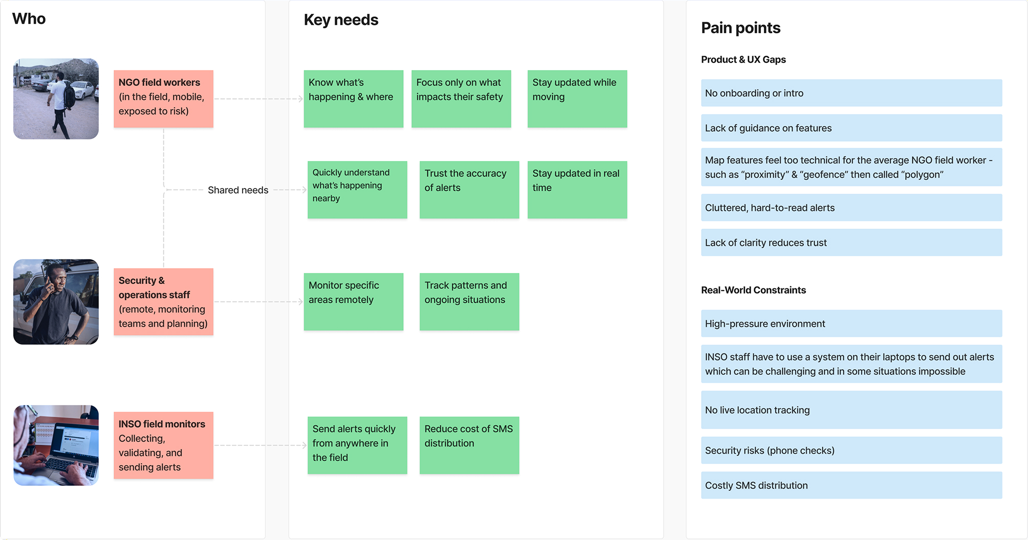
Breakdown of the different user profiles, their needs and pain points.
Login
Users were asked to act before understanding what the app does
The app opened directly on a login screen, with no onboarding. Users were asked to log in and allow location access before understanding what the app actually does.
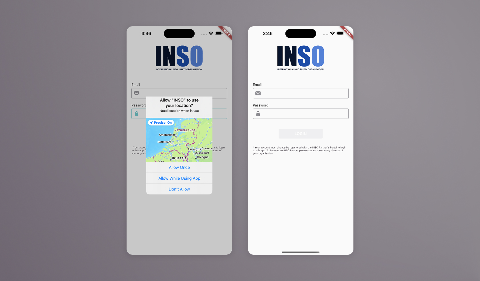
Users were asked to enable location tracking before being introduced to the app
So I introduced a simple onboarding before login
I added two onboarding screens to explain the app’s purpose and value. The goal was to inform quickly without overwhelming users (kept intentionally short).

Redesign of pre-login flow featuring 2 onboarding screens
The login itself was simplified and made more human
The login felt like a backend tool. I aligned it with the brand, improved readability, and fixed validation so errors only appear when relevant.
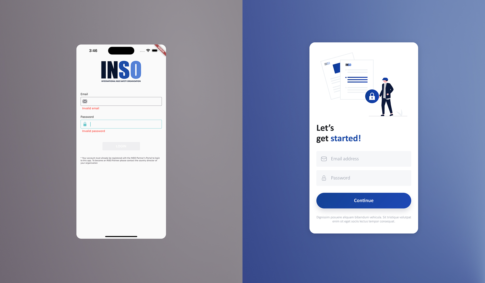
Login screen before & after – Smart validation was here one of the main experience updates
Result
Only ~30% of users understood the app in the previous design.
With onboarding, satisfaction reached 4.1/5 (78% positive), reflecting a clearer and more guided first experience.
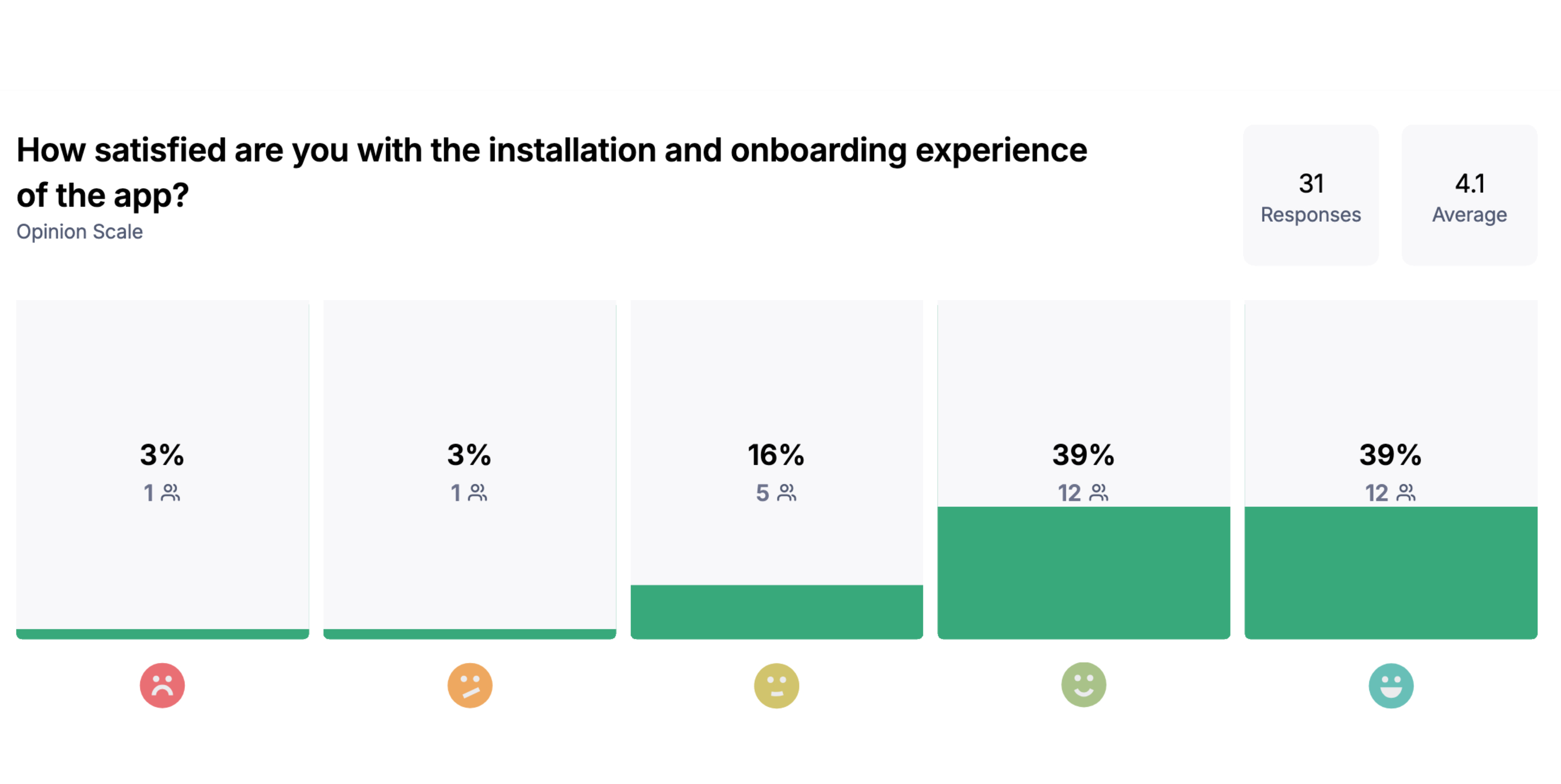
Onboarding satisfaction after redesign (31 responses, avg 4.1/5)
Alerts
The main screen had all the information, but it was hard to read and scan
The alerts screen showed many items at once, with little spacing and inconsistent typography, making key information like location or distance hard to quickly identify.
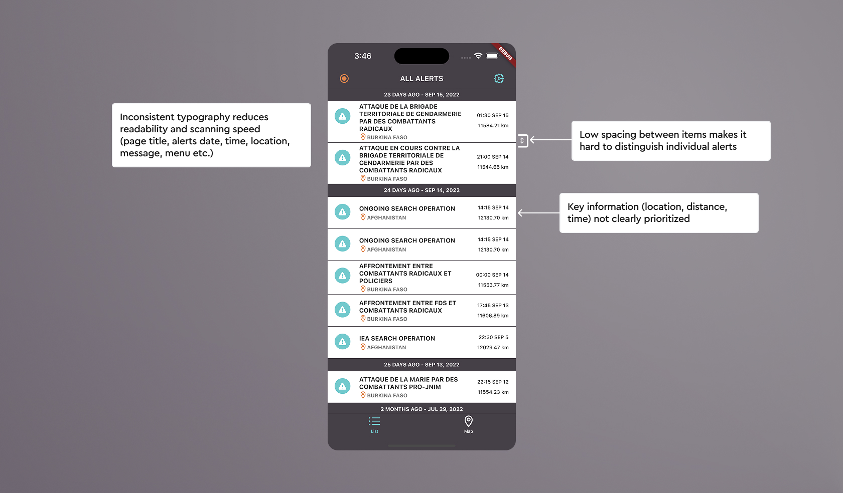
Alerts screen before redesign, showing density and unclear hierarchy
I focused on helping users find relevant alerts quickly
The goal was to improve scanning first, then support filtering (time and location), and help users distinguish new alerts. In-app guidance was added to support new users.
Search was placed at the top, filters simplified, and navigation improved with a persistent menu and clearer access to the map view.
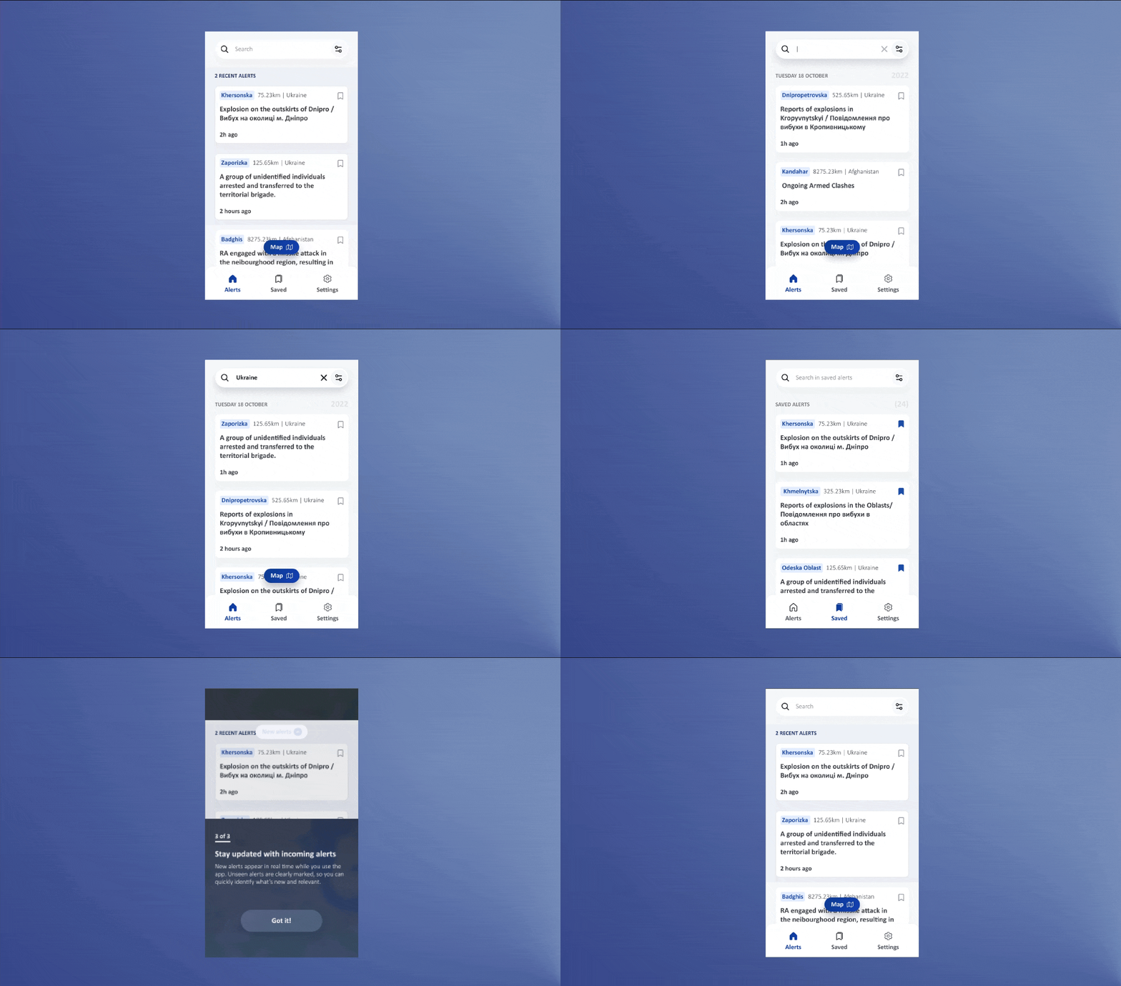
Improved alerts experience with clearer hierarchy and in-app guidance
Result
I conducted several task-based usability tests on Maze with NGO workers, covering flows like searching, filtering by date and location and saving ongoing alerts.
For brevity, this highlights the usability testing of the filtering feature. Users relied on filters to adjust location, achieving a 100% success rate, with some exploration reflected in a 36% misclick rate.
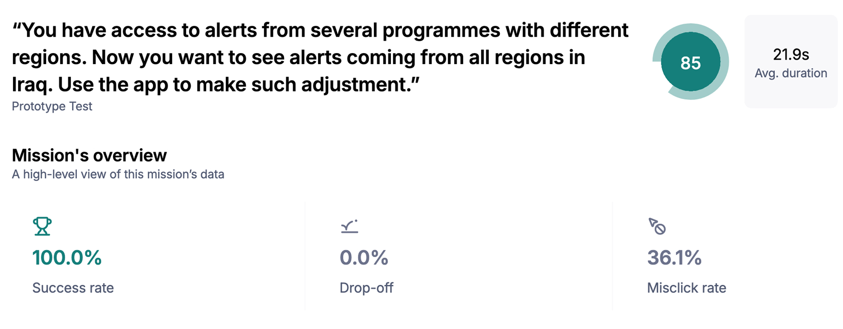
Task-based usability test scenario and results for filtering alerts by location
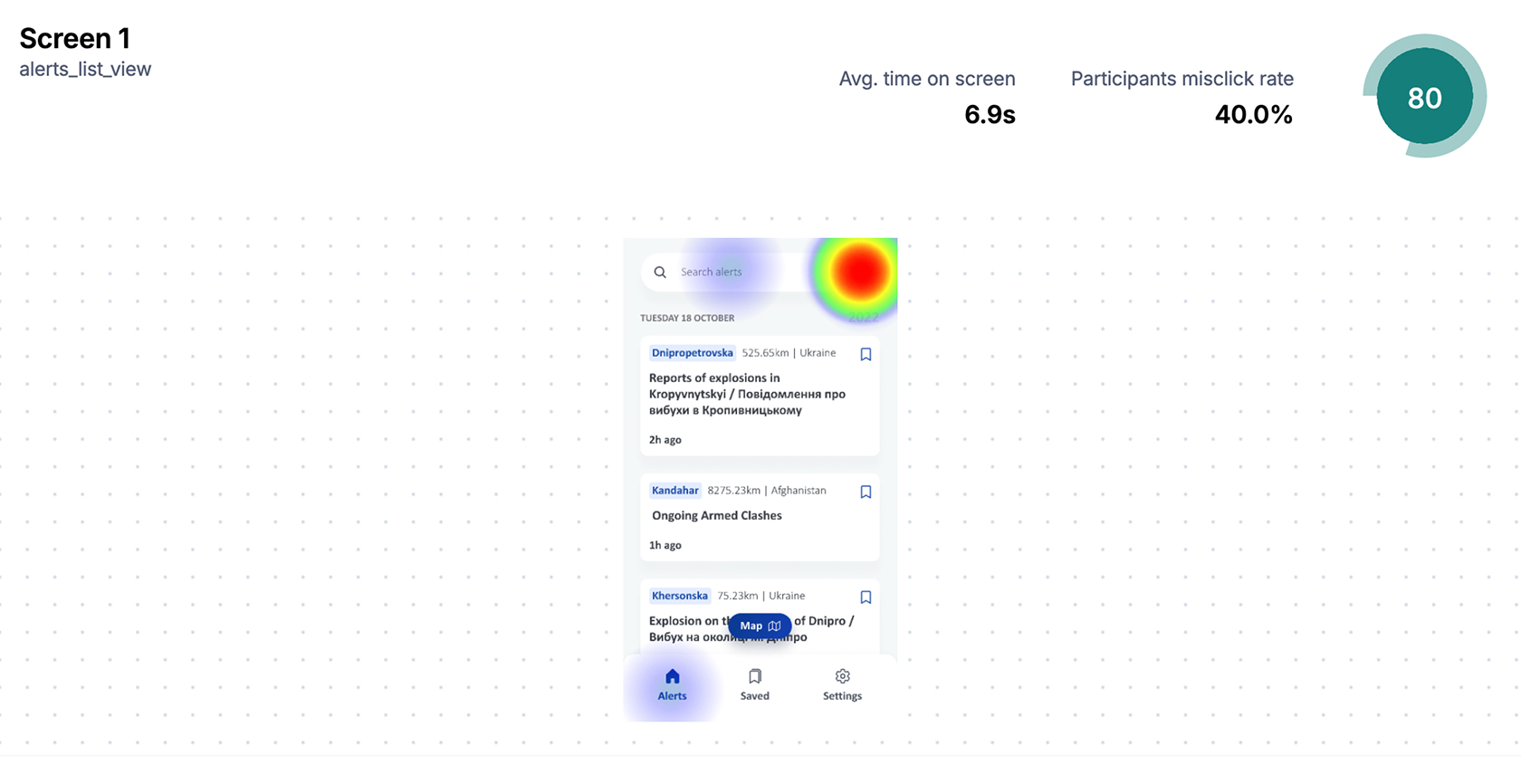
User interactions on the alerts screen during testing, showing focus on filters and search
Together with search, live updates and in-app tutorials, this improved usability and expanded the app into a tool for exploring and analysing alert patterns
Alert detail
I am now in an alert. What information will help me the most?
When a user opens an alert, they’re already looking for clarity. Research with NGO workers and INSO staff showed that incident and location details are the first things they look for, followed by updates and advice.
As shown in the former design (left), the composition of the UI contradicts the order and importance of these needs. This was my main focus while working on the redesign (right).
Alert detail screen before & after showing the differences in prioritisation of interests
The outcome was a decrease of about 13 seconds in the time it took users to get a clear understanding of the alert.
Maps
I’m dealing with incidents tied to locations, seeing them on a map changes everything.
In this app, the map plays a key role: helping users visualize incidents, explore locations and define areas of interest whether they’re on the move or monitoring remotely.
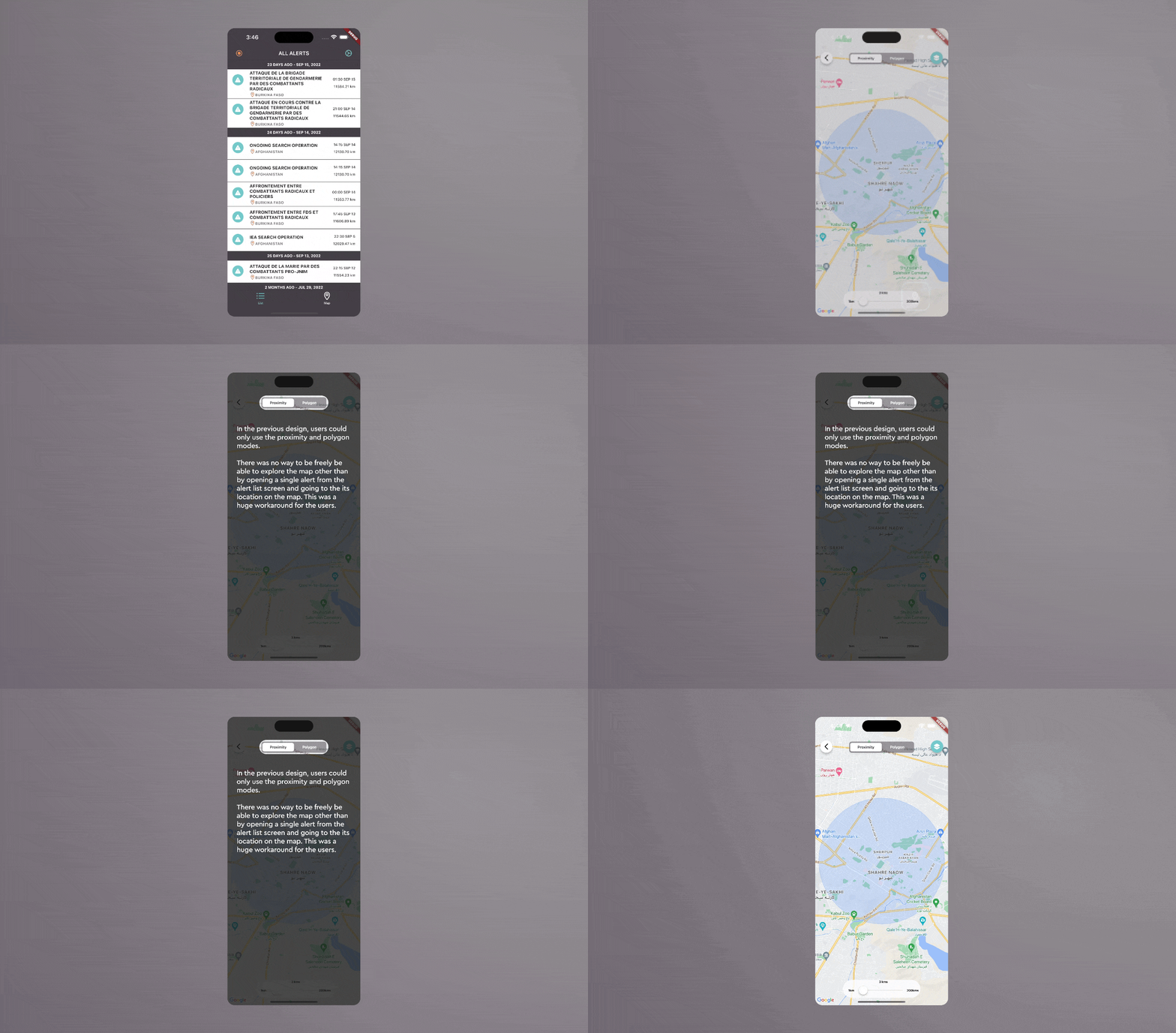
In the former design, users could only view the location of a single alert on the map. Exploring alerts geographically, on the other hand, wasn’t straightforward.
What if the map adapted to different ways of working?
Way of working 1: I’m planning a route across multiple checkpoints. How do I see what’s happening along the way before I depart?
Users expressed a strong interest in being able to explore alerts geographically, moving across locations without predefined filters.
We introduced the Explore mode, allowing users to freely navigate the map and visually discover alerts.
Result
Users showed a clear intent to access the map with the highest interaction concentrated around the entry point from the alerts list.
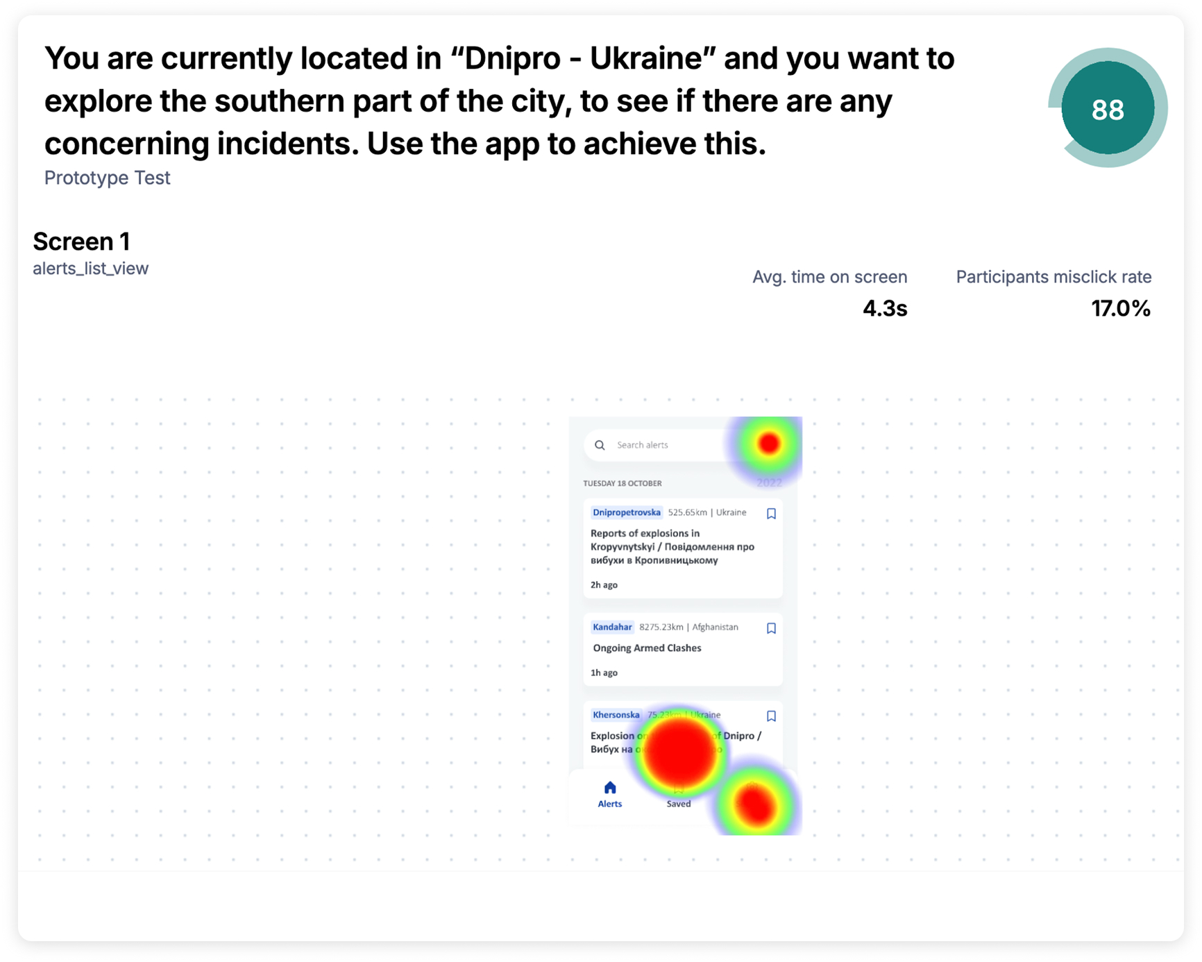
No drop-offs were observed during the task, confirming that users were able to naturally explore the map when invited to explore a location
Way of working 2: I’m not in the area I want to monitor — can I still stay informed about what’s happening there?
Many users wanted a way to see what’s happening around them while on the move, but also to monitor remote locations by setting a custom radius.
I reworked the Proximity mode, allowing users to monitor alerts within a radius based on either their current location or a custom location dropped on the map.
Results
Users were able to complete the task successfully, interacting with the radius selection and map as intended.
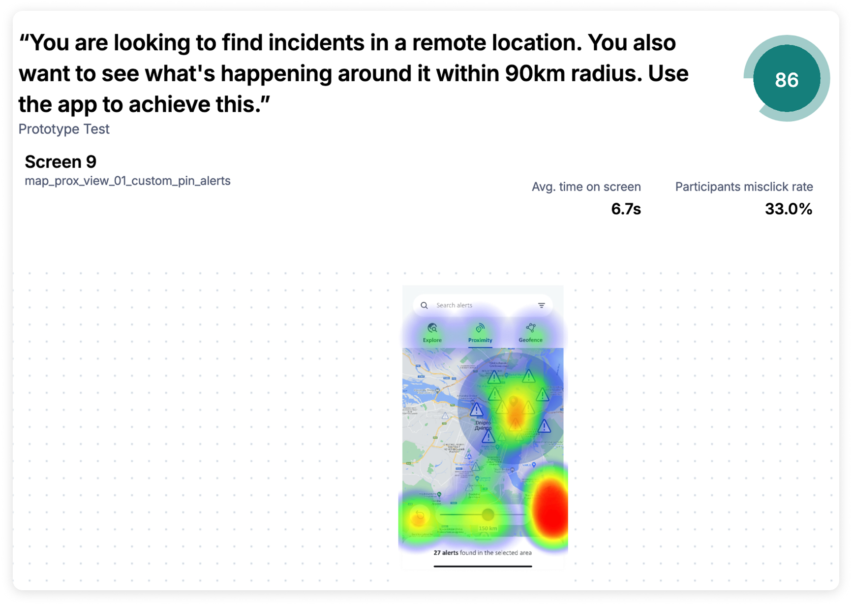
Heatmaps show activity concentrated in relevant areas, confirming that users understood how to define and monitor locations.
Way of working 3: I need to keep track of activity in a very specific area — how do I define it without overthinking it?
There was a clear need for a simpler way to define and monitor specific areas without relying on technical or complex interactions.
We simplified Geofence (formerly Polygon), allowing users to define areas directly by tapping on the map, supported by clear in-app guidance.
Outcome & Takeaways
The redesign improved how users access and understand alerts across several country offices. Designing for field contexts means accepting constraints such as, low connectivity, high stress, no room for confusion. That shaped every decision.
