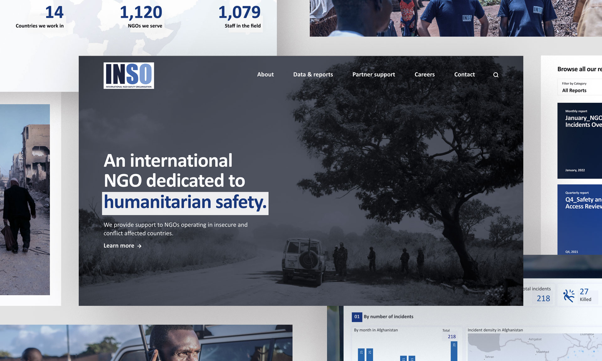
Background
INSO provides safety analysis and incident reporting for NGO workers operating in high-risk environments. The website acts as the main entry point to access this information, communicate the organization’s role, and support different types of users.
My main goal in this project was to redesign and implement a new website that clearly shows the value of INSO’s work, gives different users a way in and makes trust and clarity the default experience.
At first glance, the problem seemed straightforward.
INSO needed better visibility among NGOs, and the website wasn’t effectively supporting recruitment.
But as the project unfolded, it became clear that these assumptions were not backed by data.
| Initial assumptions | What we found |
| NGOs lack awareness of INSO | No data to confirm this |
| Website underperforms for hiring | No baseline to measure it |
| A redesign would solve the issue | No clearly defined user problems |
There was no analytics in place prior to the redesign, and no way to evaluate whether the website was effectively communicating its value or supporting recruitment.
Decisions were expected to be data-informed, but no reliable data existed
This shaped the nature of the project. Direction was largely driven top-down, while my role gradually expanded beyond design into implementation, planning, and coordination.
Within that context, I still tried to introduce structure where possible. I defined user groups, mapped their needs, and later initiated usability testing on my own.
User groups
One of the first steps I took was to clarify who the website was actually serving.
With no clearly defined user groups, I created a simple structure to organize the different audiences based on available information and internal validation.
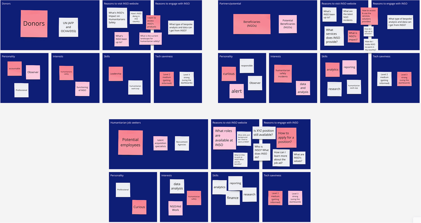
Extract from the website’s user persona exercise
1. Donors, UN/OCHA, General Public
Senior stakeholders interested in updates across INSO’s countries of operation and analysis produced at HQ.
2. Subscribed NGOs / Potential Subscribing NGOs
Field specialists looking to stay informed on developments in their region, often relying on tailored analysis beyond standard data access.
3. Professionals seeking job opportunities in the humanitarian field
Users looking to find, understand, and apply to job opportunities easily.
What data was available?
With no analytics in place, the only available inputs were two internal surveys. While they provided some direction, they were broad and not always directly actionable.
Survey 1 – Perception: Focused on how users described the website and what they expected from it.
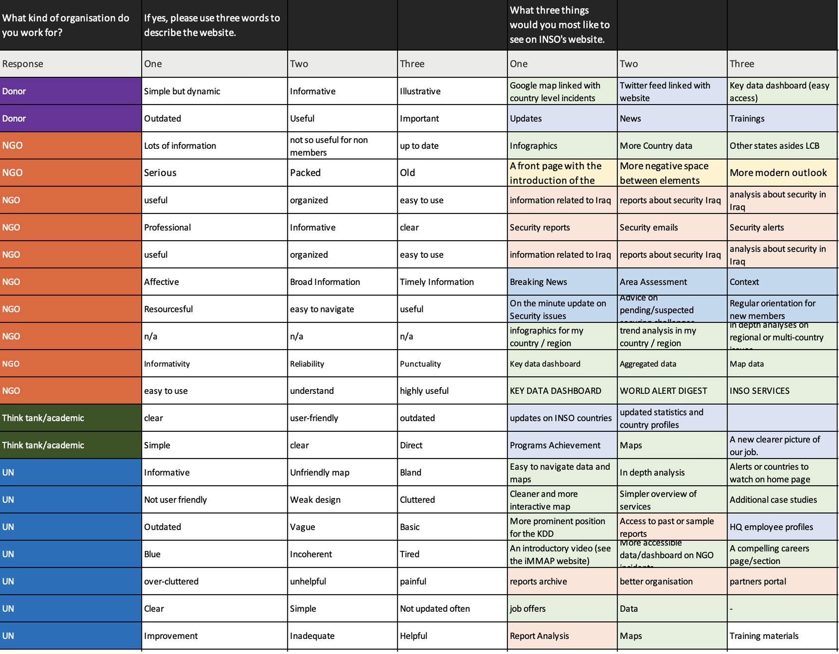
Aggregated survey results. This is one piece of the full survey run by 600+ different actors in the humanitarian sector.
The most useful insight came from recurring requests for clearer access to dashboards, maps, and analysis content.
Survey 2 – Services: Highlighted which services were most valued, particularly analysis reports and incident tracking.
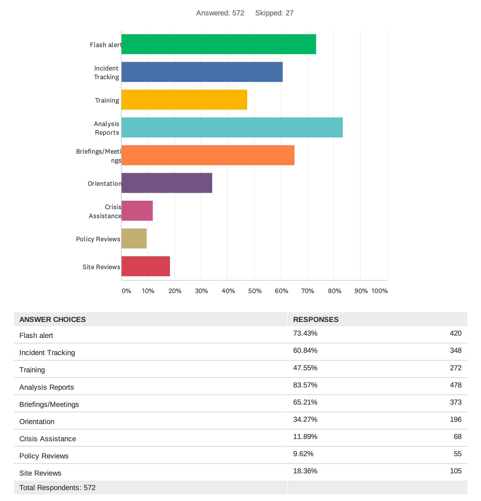
INSO services popularity
While these inputs helped support certain decisions, most key decisions regarding content and structure were ultimately made top-down.
Formulating challenges by user group
Based on available inputs and internal discussions, I structured the main challenges by user group to guide design decisions.
NGOs
- Limited awareness of INSO and unclear understanding of its services and value.
- Difficulty accessing and understanding available safety and analysis products.
Recruitment – Candidates
Lack of clarity on roles, working environment, and difficulty browsing job opportunities, especially by locations
Recruitment – Internal (HR)
Challenges managing job postings and tracking their performance across platforms.
General Public
Limited visibility into INSO’s day-to-day operations and analysis beyond official reports.
Ideate
While ideation was not a formal or collaborative phase of the project, ideas gradually emerged through discussions with my line manager as we progressed. I organized them into a card-based system to group and clarify user needs.
The affinity map below reflects this synthesis.
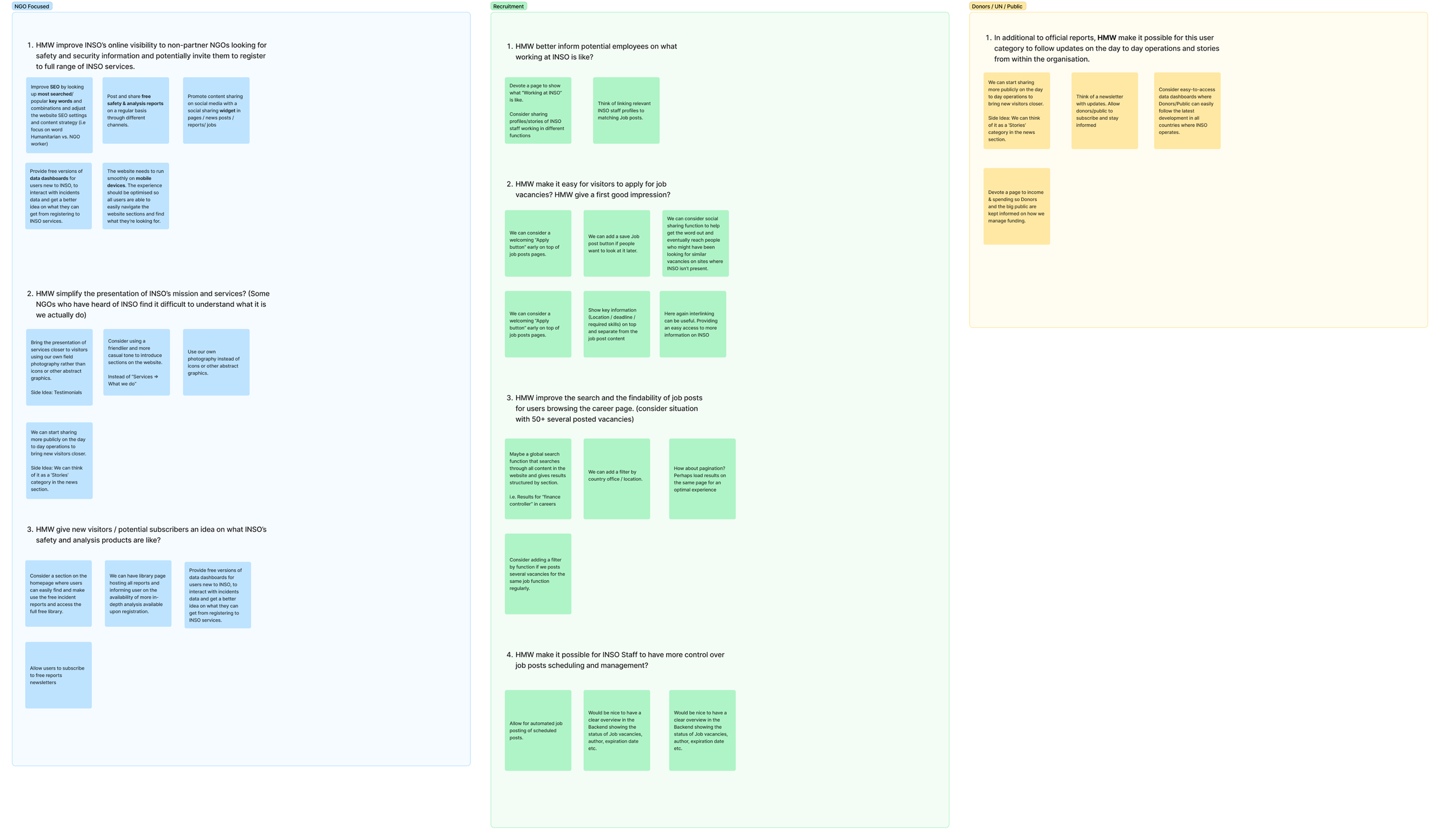
Summary of ideation through affinity mapping exercices
Structuring ideas into task flows, sitemaps and wireframes
Use case scenario
To structure the experience, I focused on key user journeys. One representative case:
How might a non-partner NGO planning an operation find relevant information and eventually register for full access?
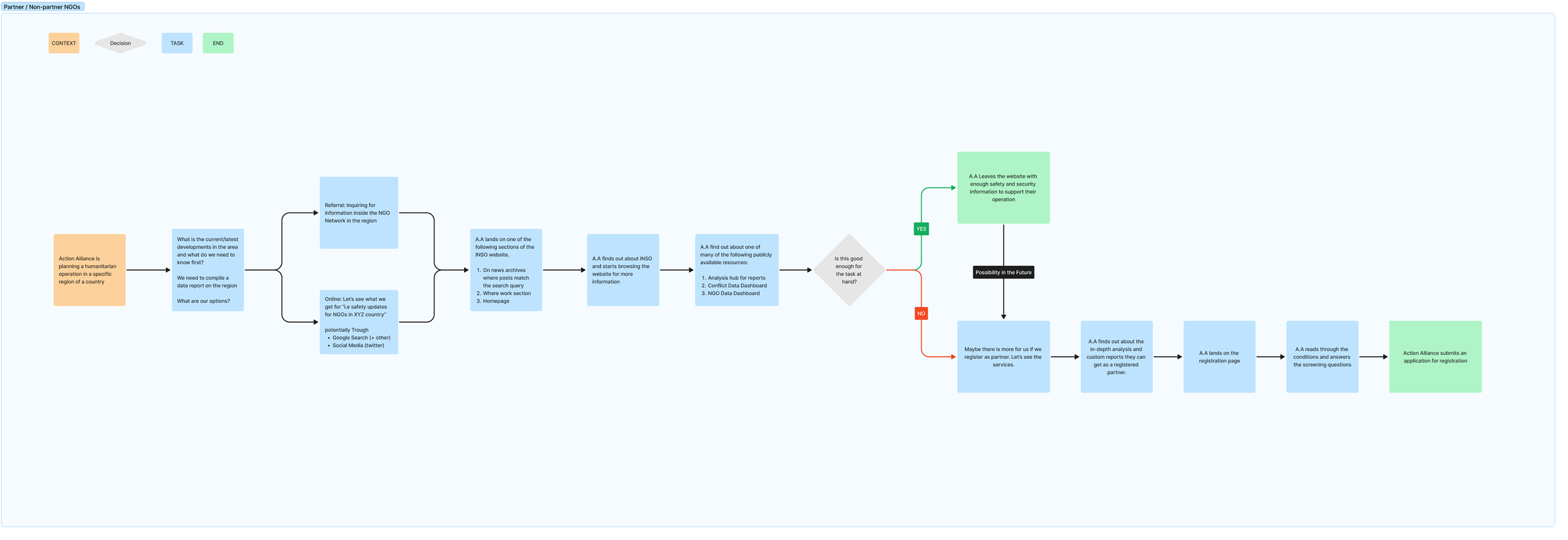
The diagram illustrates a simplified journey from public content to registration.
Website sitemap
The structure was iteratively refined from an initial draft, with a focus on simplifying navigation, grouping related content, and making page naming more clear and accessible.
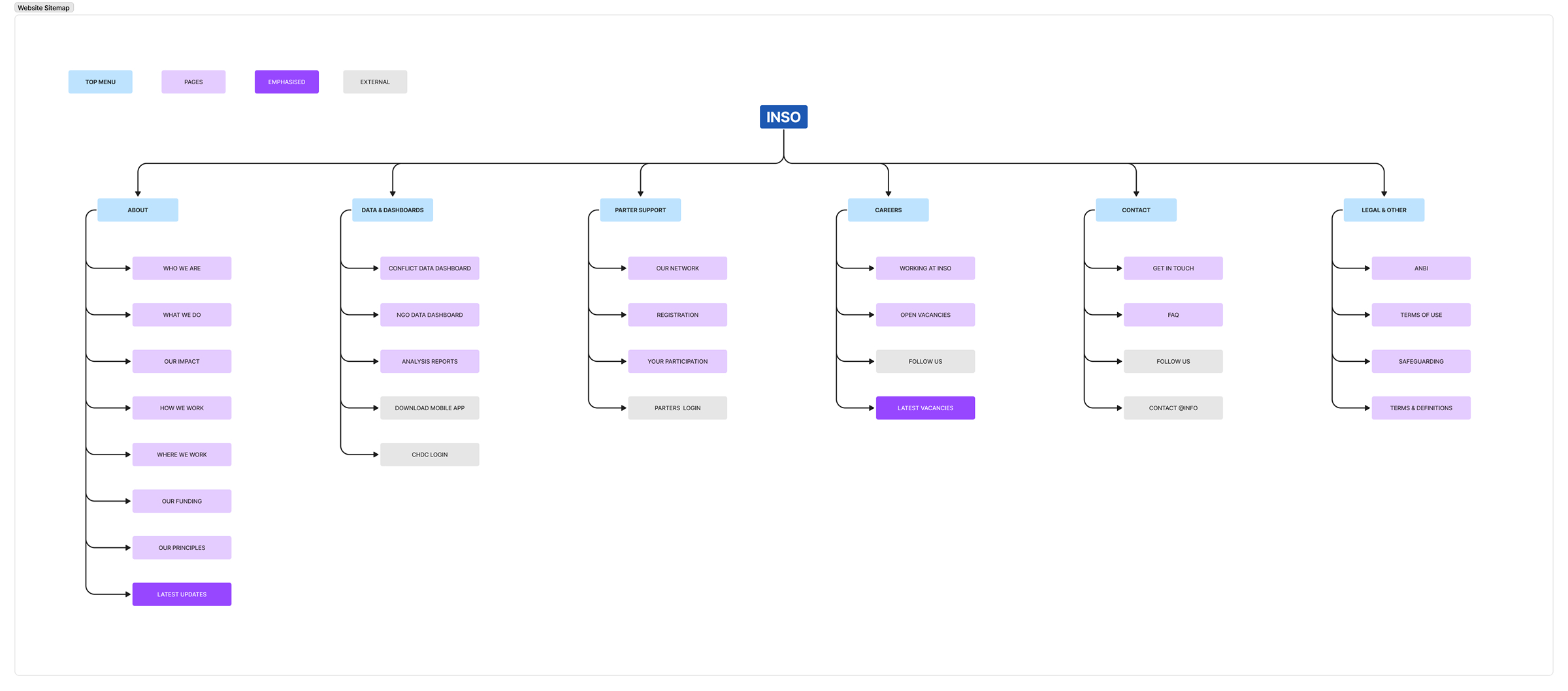
INSO website sitemap (as of April 2022)
Wireframing
I started with a mockup of the homepage with placeholders then with the assistance of our communication manager, we defined the form, tone and length of the content to be used in a way that answers user needs effectively.
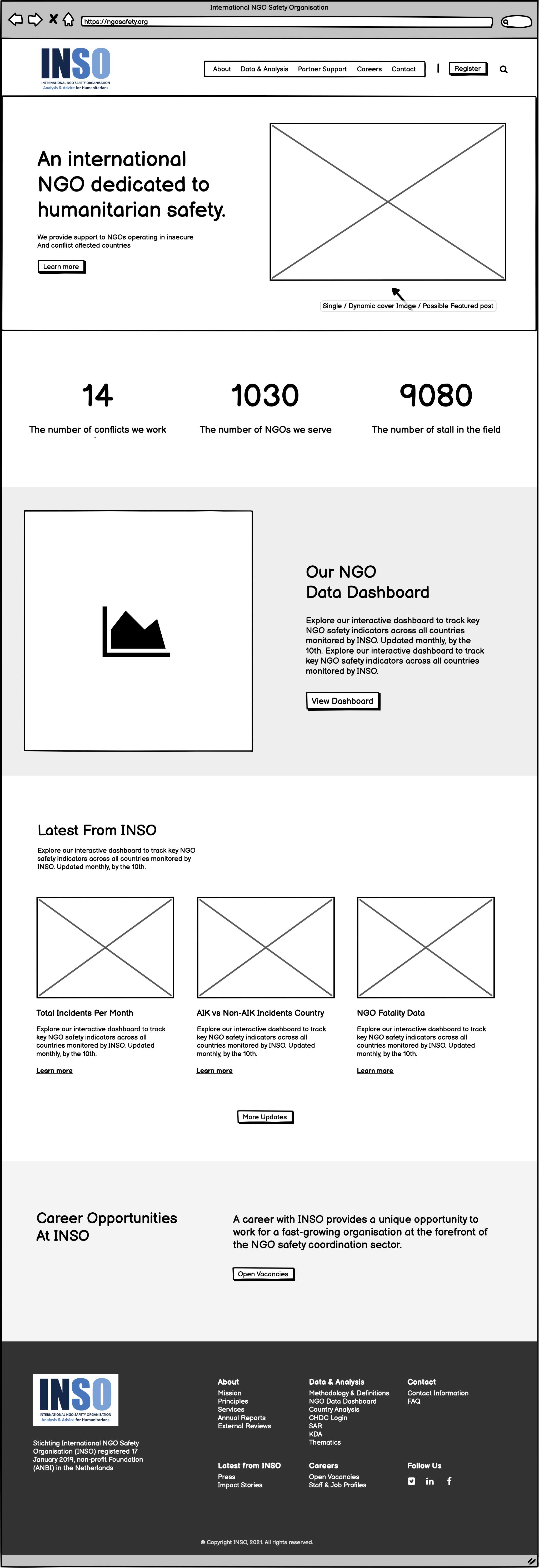
The homepage wireframe served as a foundation for the rest of the website’s wireframing.
Visual style
The revamp required updating INSO’s visual style, particularly the colour palette and typography, which felt outdated and inconsistent in parts of the existing website. I reworked the palette to improve contrast and usability across different contexts, while still keeping a clear link to INSO’s original branding.
This work later evolved into a more complete brand guide used internally by INSO.
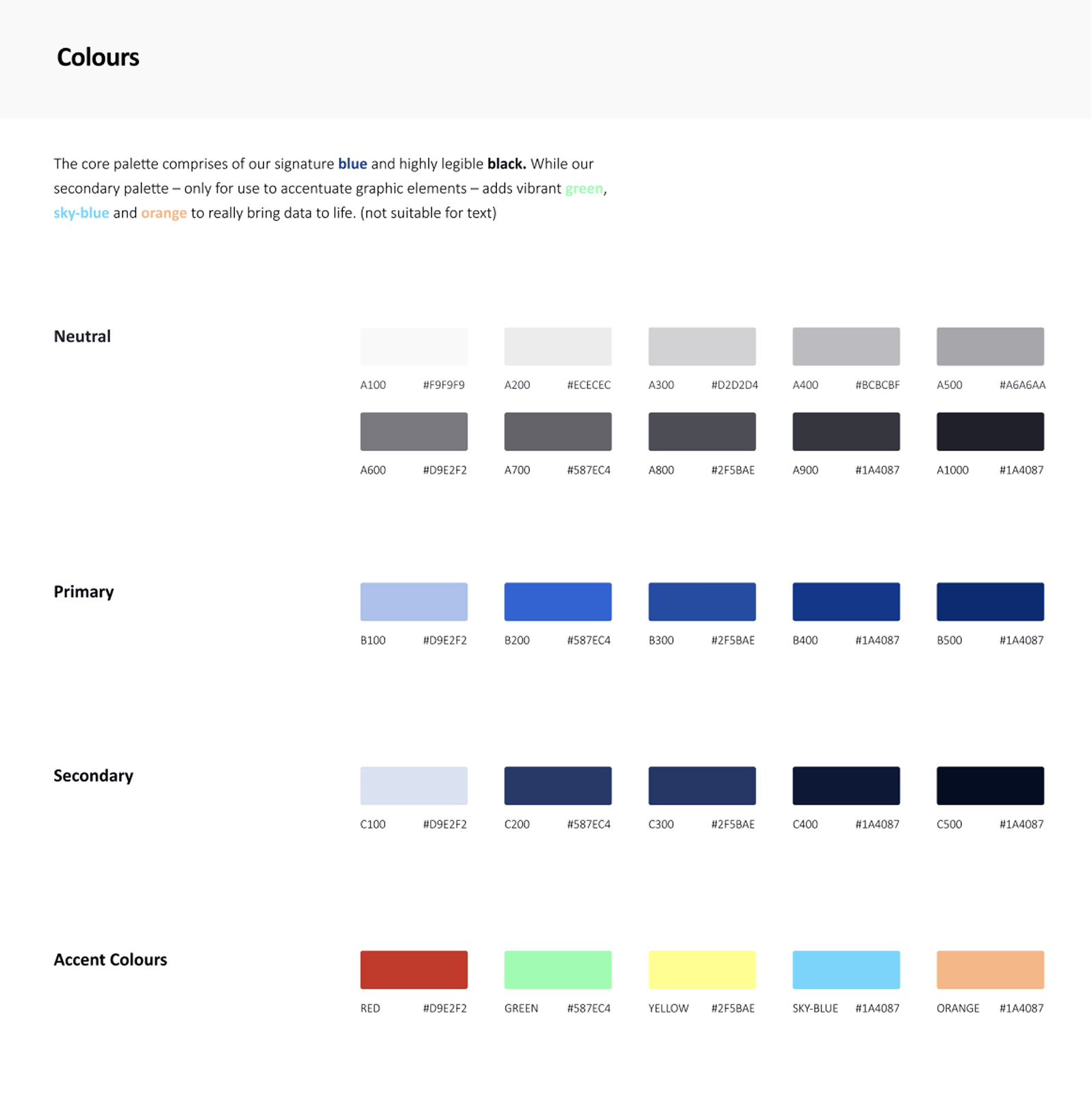
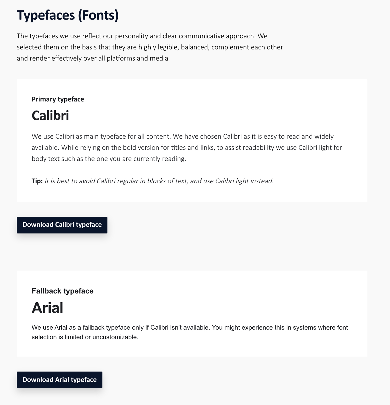
The website’s visual style guide
What changed?
I redesigned the homepage to better reflect what INSO does and make key information easier to understand and access.
Compared to the previous version, the new design puts more emphasis on real-world visuals, clearer messaging, and structured content. It introduces key figures to give a quick sense of scale, makes public reports more accessible, and reduces reliance on dense text and static elements.
The overall layout was also simplified to guide users more naturally through the content, starting with what INSO does before moving to updates and job opportunities.
- More visual and less text-heavy content
- Clearer introduction of INSO’s mission and role
- Key figures added to give a sense of scale
- Easier access to reports and data
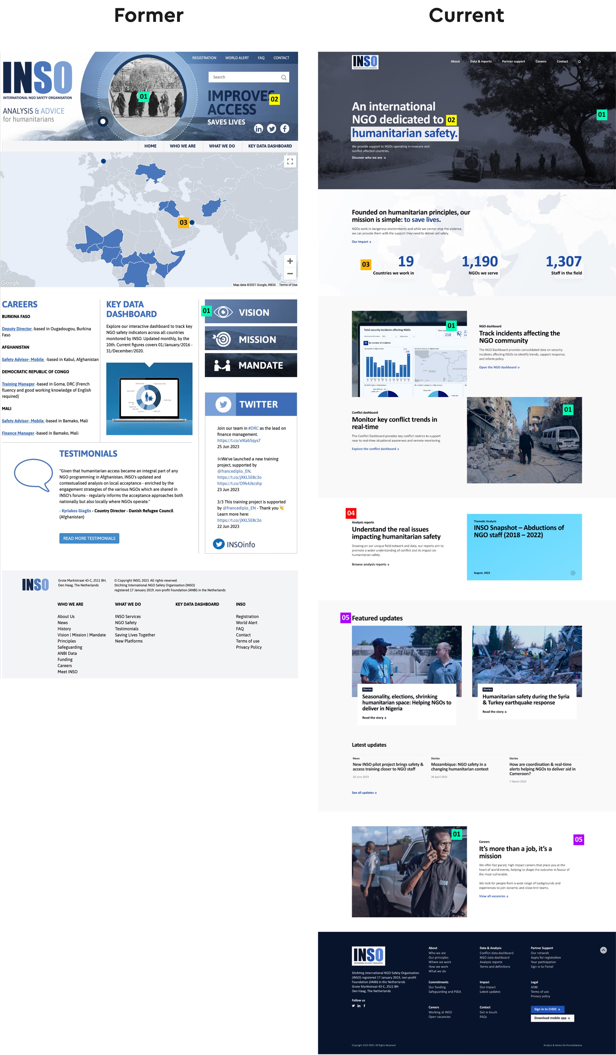
INSO Website – former & current homepage design comparison
Explore the full website: NGOsafety.org
Usability Testing
Task based testing
I conducted task-based usability testing with INSO staff to validate whether users could find and understand key information.
In these sessions, participants completed 2–3 tasks and performance was evaluated across three levels: failure, success with difficulty, and success.
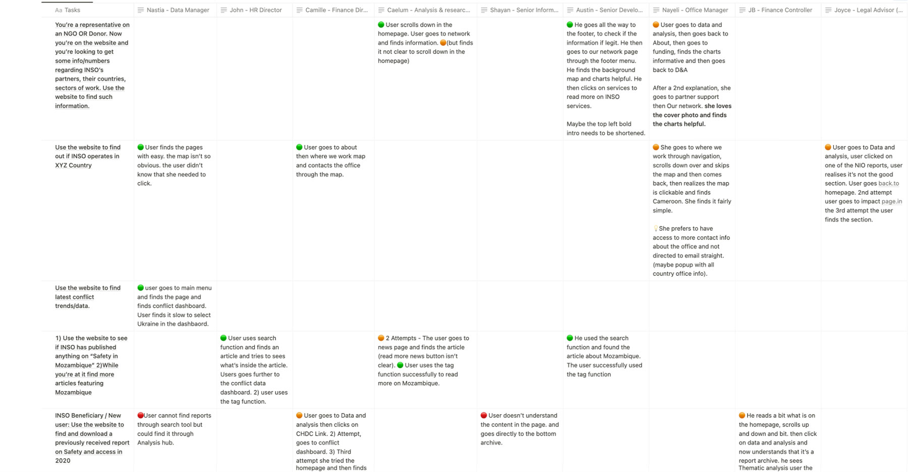
Usability testing report – Task based session
Open feedback
I asked participants to share their impressions as they used the website, and encouraged them to think out loud while completing tasks.
This helped me capture what felt unclear, confusing, or harder to use, along with suggestions for improvement.
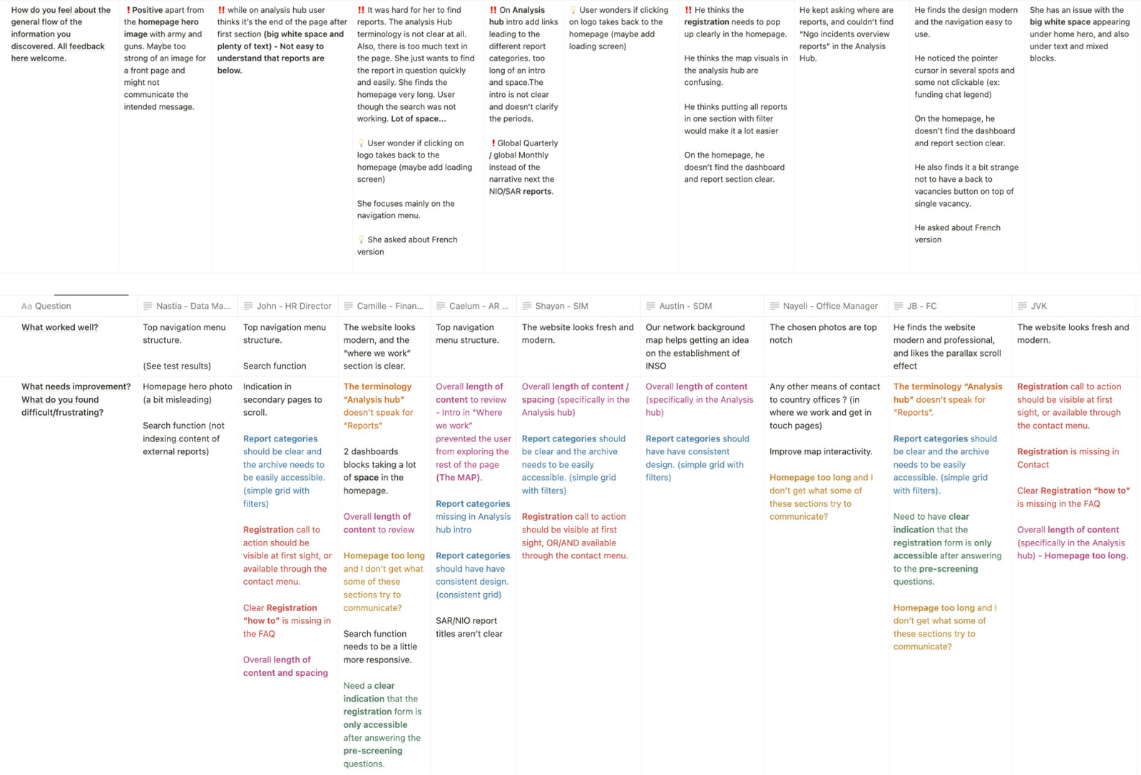
Usability testing – short interview + open feedback session
Iterate with an action plan
I then organized the findings into an action plan to guide further improvements, addressing some issues while deprioritizing others.
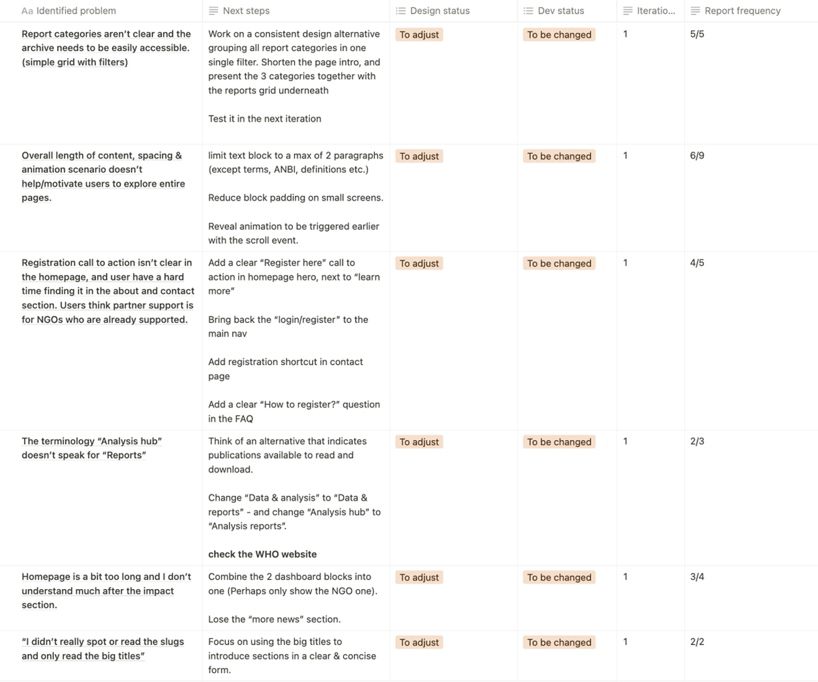
Post UT action plan
Build / Implementation
Frontend: Building the custom theme
I structured the website using a combination of reusable components and flexible templates, allowing different types of content to be built consistently across pages.
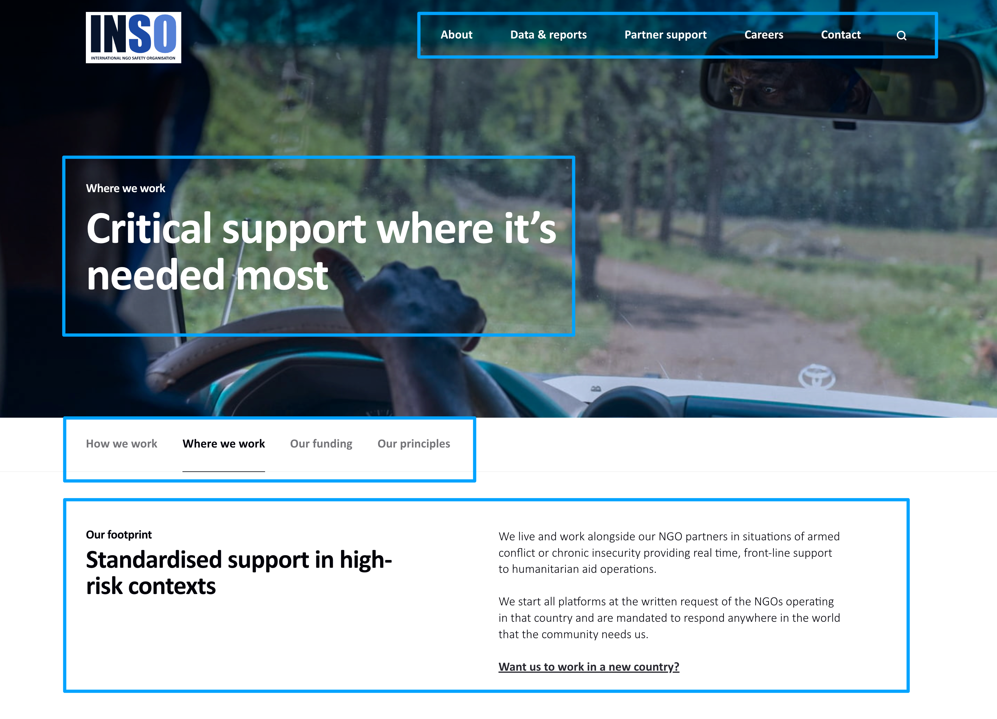
Example of editable components (Navigation, Hero section text, relative content navigation, 2 columns title/text
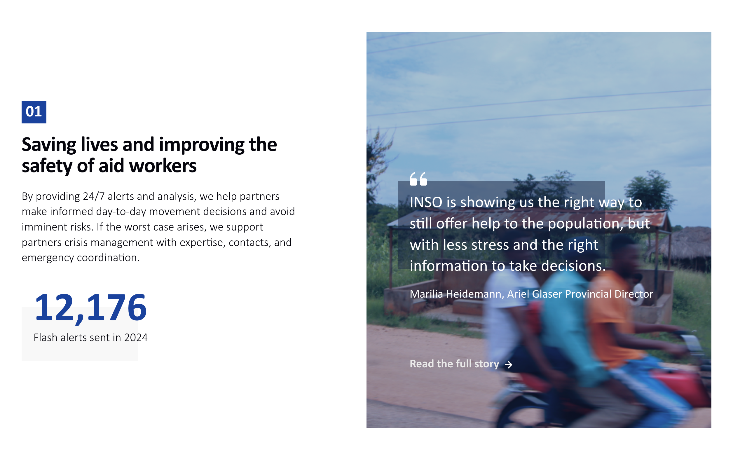
Ordered blocks were used to communicate information in different formats (text, data figure, visual & statement) and in a specific order.
Once the structure was defined, I implemented the design in plain HTML, SCSS, and JavaScript, focusing on responsiveness, interaction, and long-term maintainability.
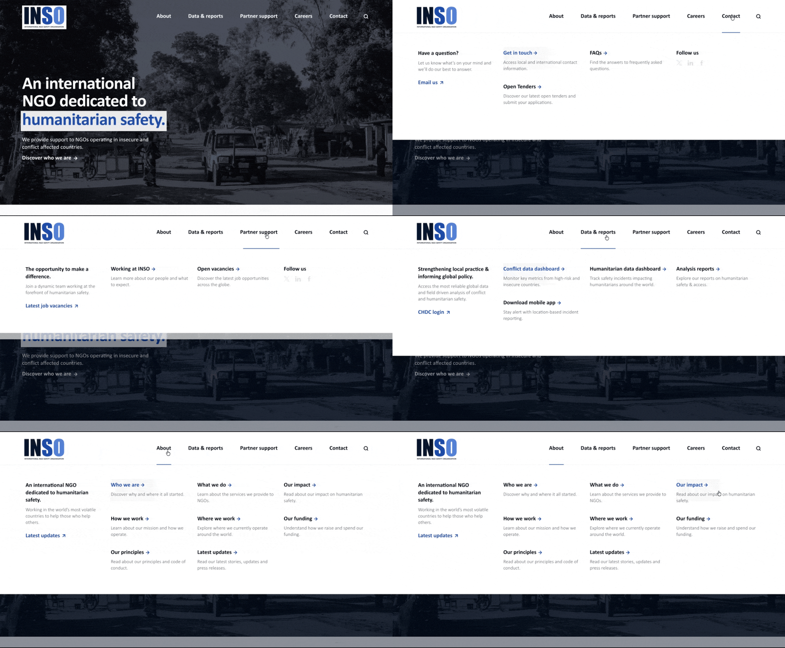
Desktop navigation with multi-level interactions and hover states
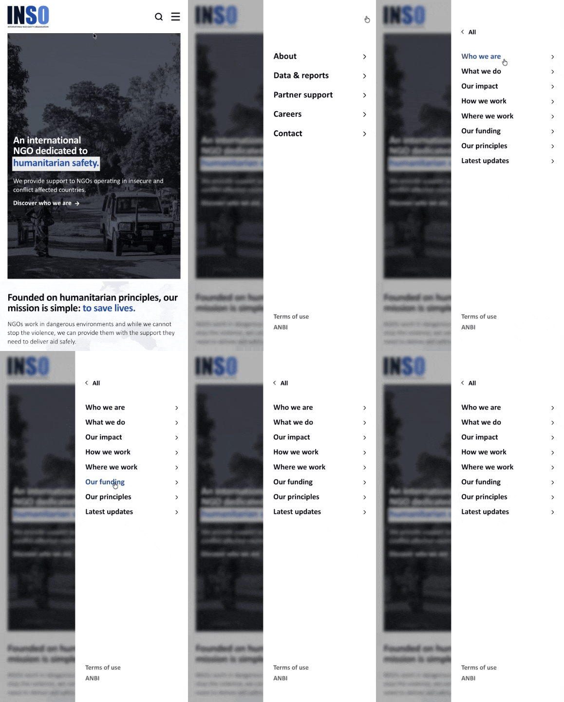
Mobile navigation with nested structure and touch interactions
Customisation work in the content management system (CMS)
Since I developed the website on a custom WordPress theme, I used ACF (Advanced Custom Fields) to build the content management layer. This way, non-technical teams can manage content independently.
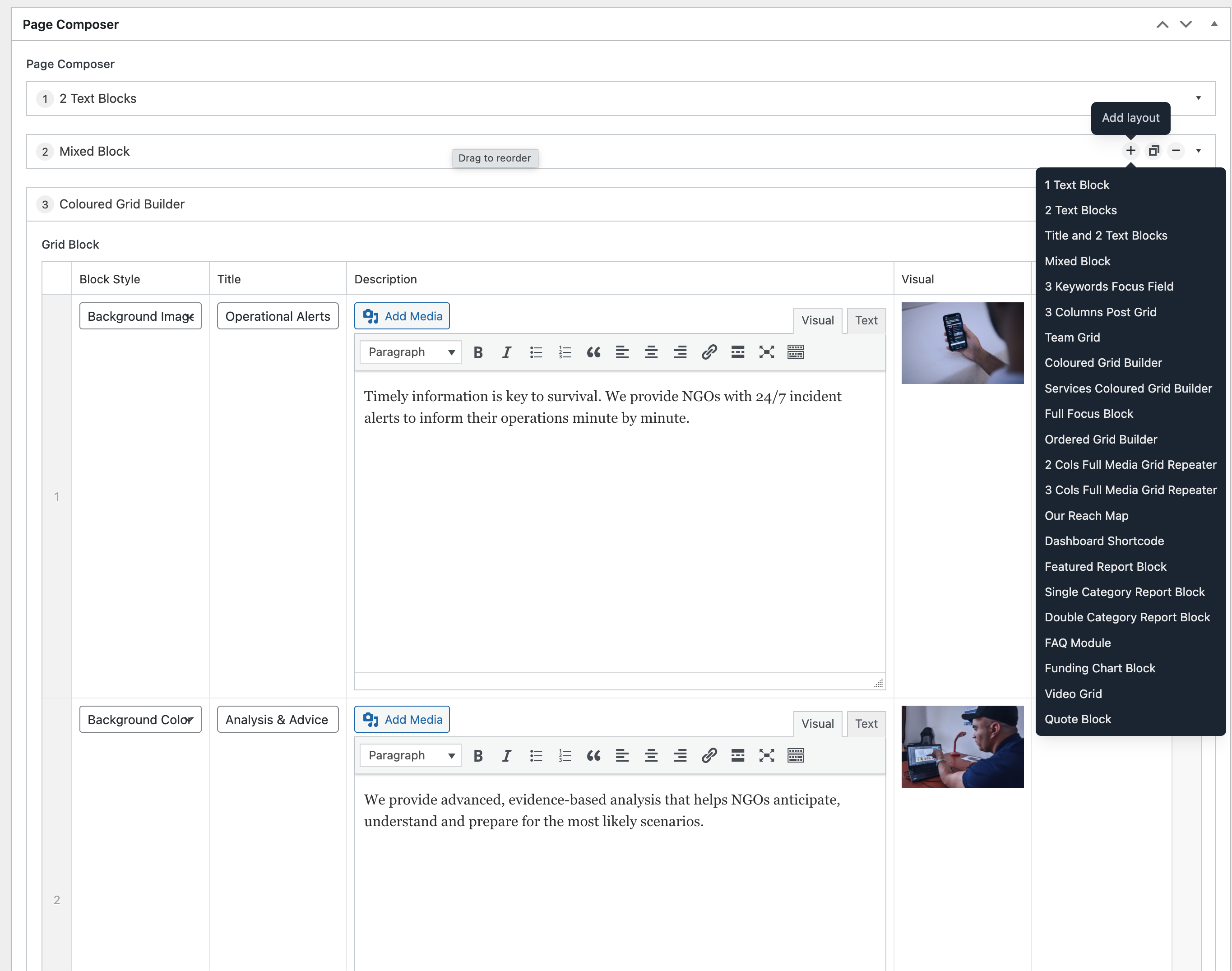
Flexible page builder using ACF, allowing non-technical users to compose pages using predefined components.
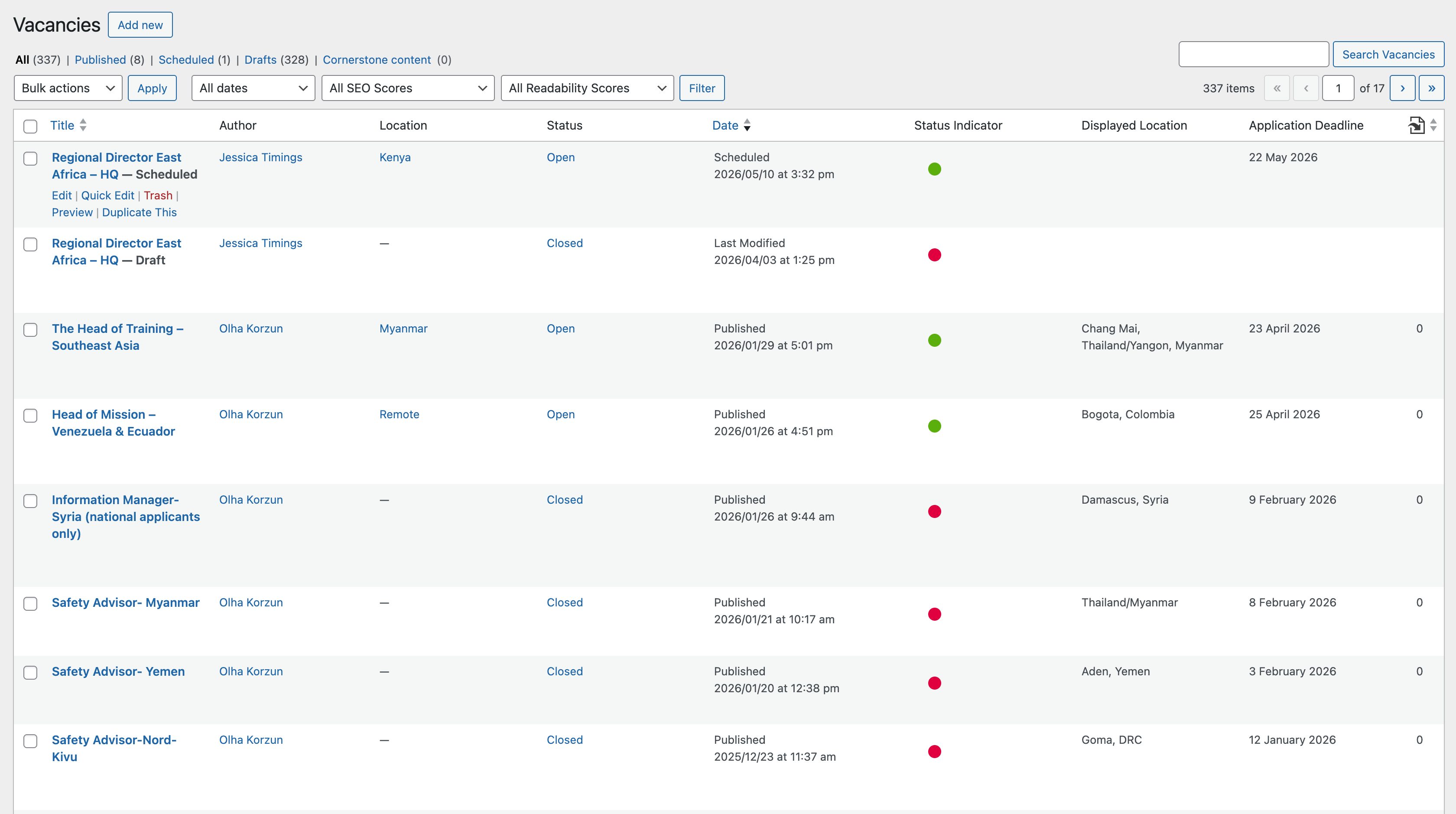
Custom vacancies management system with status indicators and expiration logic, enabling HR to manage job listings directly.
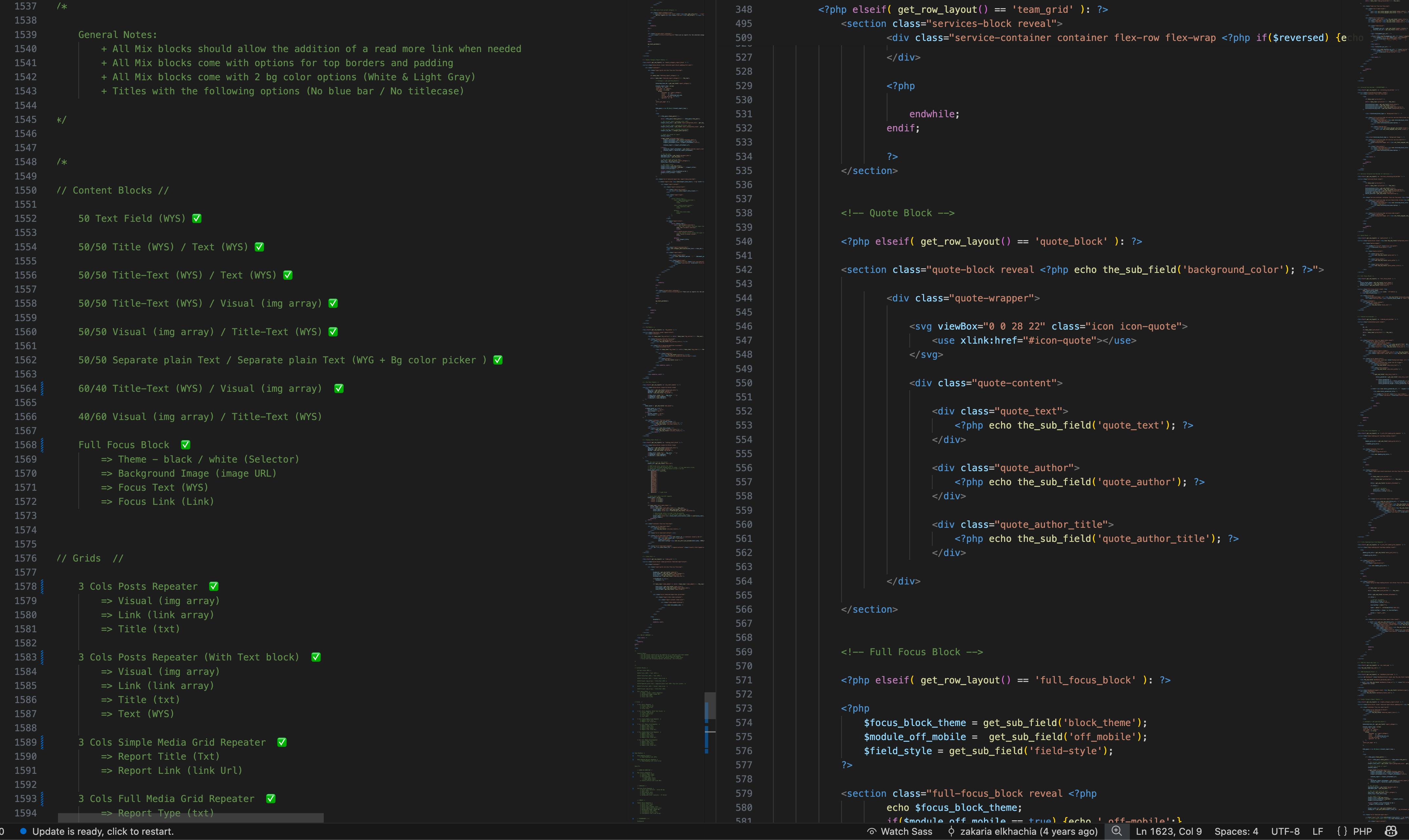
Example of reusable component structure in PHP, powering the modular page builder and dynamic layouts.
Outcomes
The new design led to noticeable improvements in engagement and navigation across the website.
I set up analytics on the former site during the project to establish a baseline, allowing a direct comparison with the updated version.
The results below show how user interaction improved across key metrics.
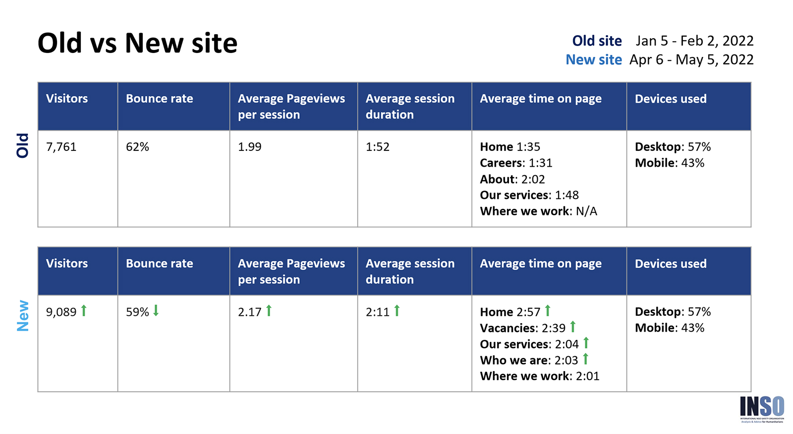
Website evaluation through analytics
Conclusion
The new design led to measurable improvements in engagement and navigation. Setting up analytics on the former site mid-project was the right call as it gave us a baseline and made the results visible.
With limited data and top-down constraints, introducing usability testing on my own initiative was the most useful thing I did.


